Modernist Origin Dashboard

Modernist origin studies in small batches. This is not final PDP copy. It is a research and concept review surface for choosing believable visual-origin stories before writing polished product descriptions or Print Stories.

Modernist origins / working board

What is strong enough to write, what needs one more visual test.

This top board is the art-direction layer. The detailed research remains below, but the decision should be readable here without scrolling through every reference.

5 locked enough for story drafting
5 approved but worth retesting
6 active contenders still open
10+ parked routes removed from the main argument

Locked / Keep Writing

These have a specific visual hook and enough place logic to become PDP copy or Print Story foundations.

Prague wallpaper pattern Legiobanka facade in Prague with Rondocubist geometry

Prague

Locked
Rondocubism / Legiobanka

A rare city-specific geometric language: national modern ornament already behaving like architectural wallpaper.

Open Prague detail
Athens wallpaper pattern Pikionis Acropolis path paving in Athens

Athens

Locked
Pikionis underfoot + column afterimage

The story feels lived rather than postcard: ancient vertical memory broken into modern paving, steps, fragments, and rhythm.

Open Athens detail
Amsterdam wallpaper pattern Het Schip Amsterdam School brick facade

Amsterdam

Locked
Amsterdam School / Het Schip

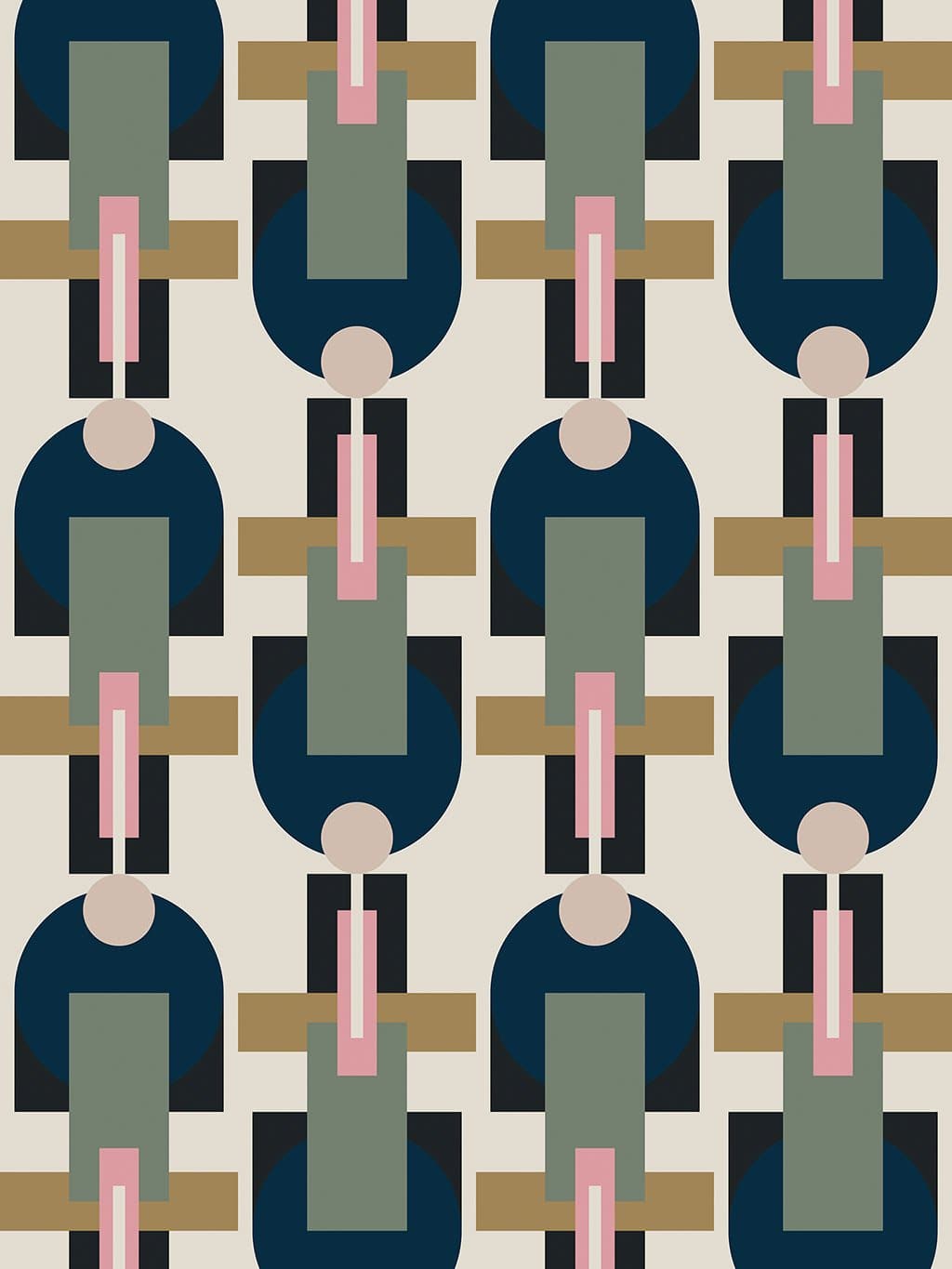
Expressive brickwork, arched detail, and built ornament give the print a believable Amsterdam source.

Open Amsterdam detail
Warsaw wallpaper pattern Supersam construction in Warsaw showing pleated roof structure

Warsaw

Locked
Supersam pleated roof

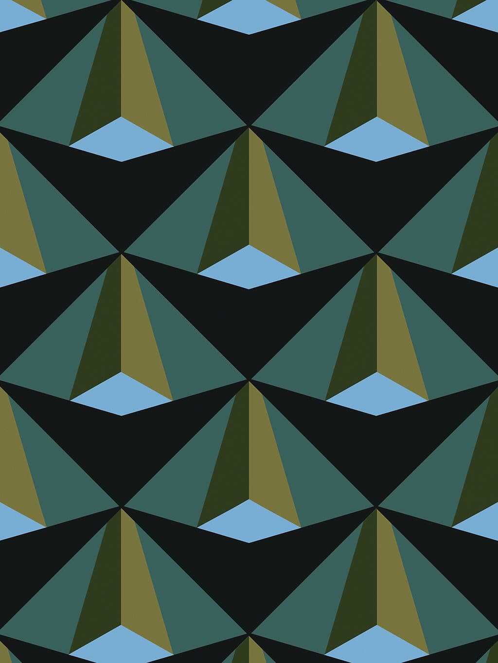
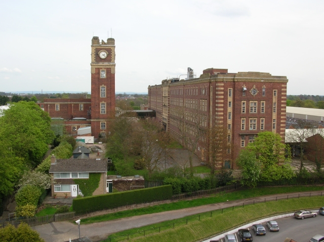
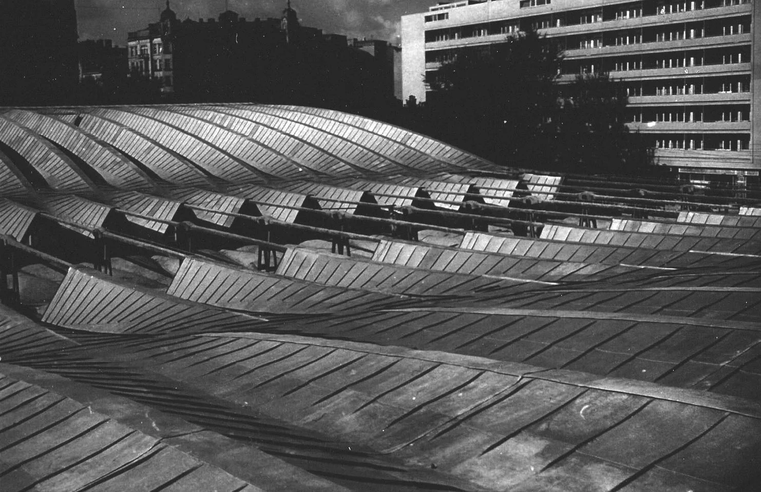
Obscure but strong: a demolished postwar structure whose folded roof gives the print its structural memory.

Open Warsaw detail
Lyon wallpaper pattern Lumiere cinematograph mechanism

Lyon

Locked
Lumiere projection afterimage

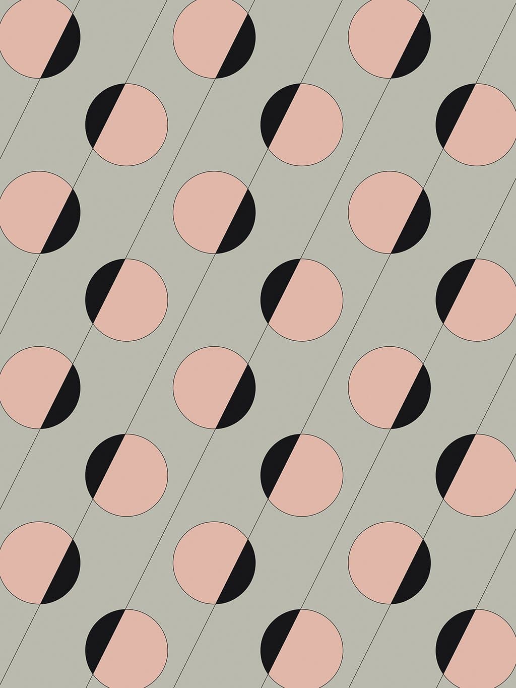
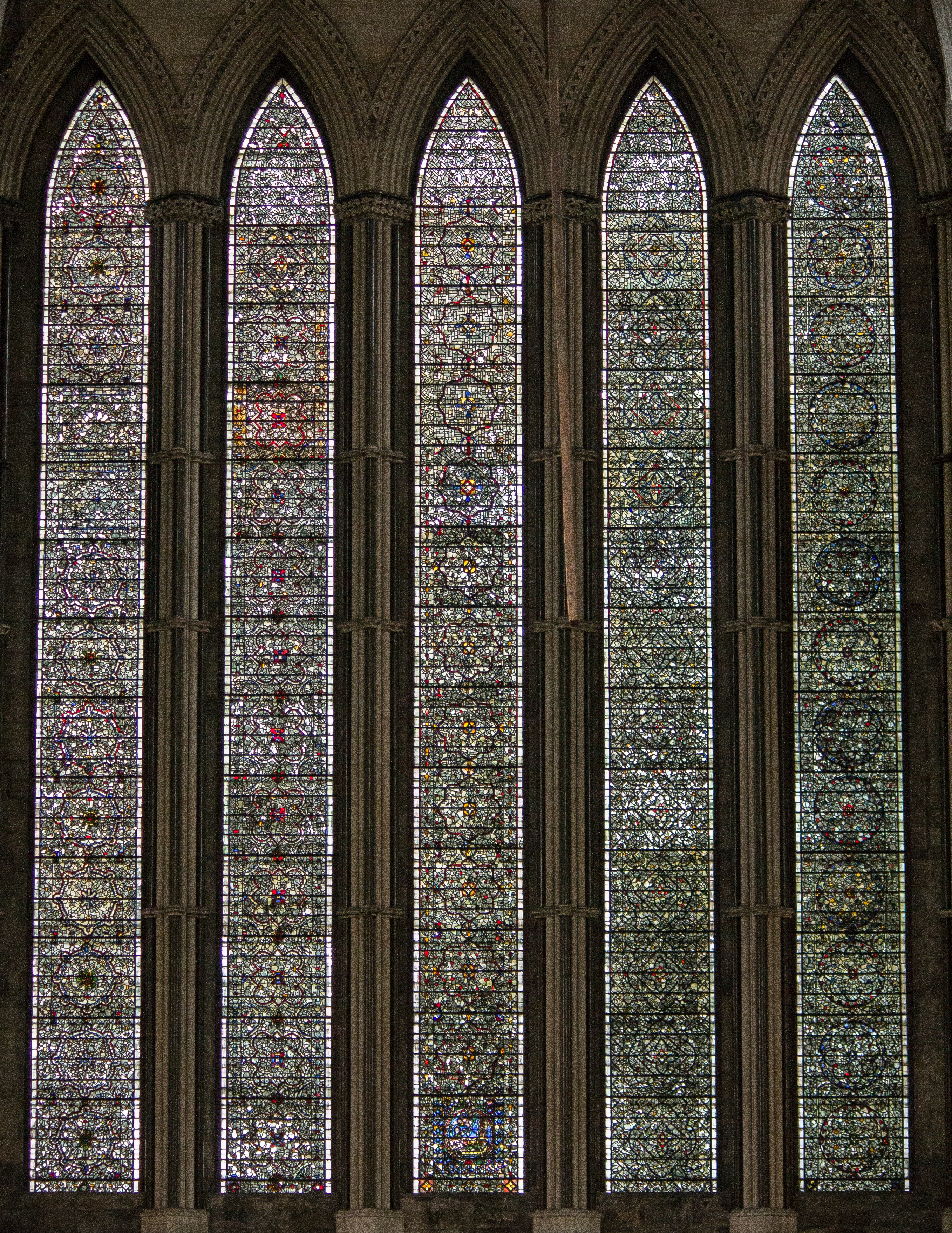
The circles, cuts, and diagonal scoring still read closer to shutter, reel, lens, and projection than to Jacquard weave.

Open Lyon detail

Retest Before Copy

These are not failures. They are approved directions that may have a sharper, less generic version waiting underneath.

Paris wallpaper pattern Sonia Delaunay geometric textile rhythm reference

Paris

Retest
Sonia Delaunay textile practice vs Cercle et Carre

Cercle et Carre is real but thin. Delaunay is more useful if the print needs a Paris surface-design lineage.

Open Paris detail
Miami wallpaper pattern Miami Bacardi mosaic wall detail

Miami

Retest
Sharpen Streamline into object, surface, or interior

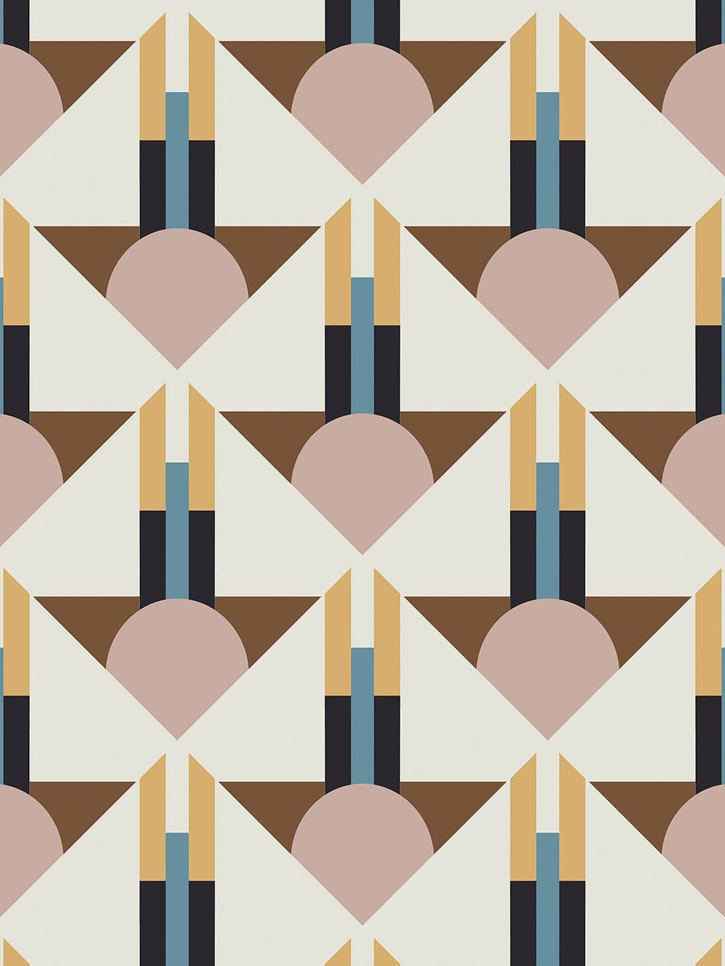
Pastel Deco works as atmosphere, but Lapidus interiors, breeze blocks, or Bacardi mosaic may sell the visual link harder.

Open Miami detail
Tangiers wallpaper pattern Tangier medina doorway with arched plaster and green tile

Tangiers

Keep
Arch and stripe threshold

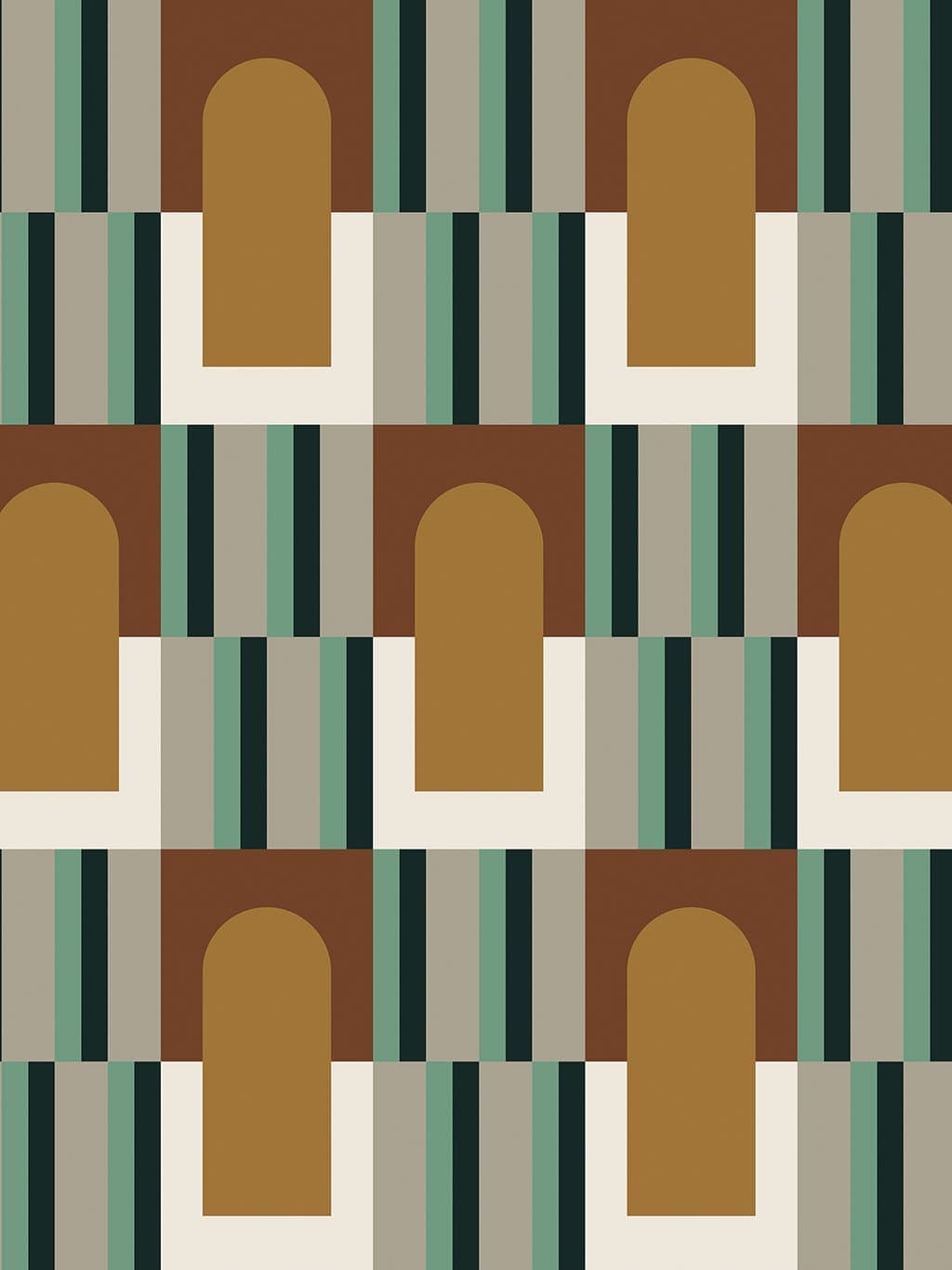
Use the older route: gates, plaster arches, green tile bands, ochre-brown shadow, and striped shade as a Tangier threshold memory.

Open Tangiers detail
Busan wallpaper pattern Gamcheon Culture Village in Busan

Busan

Retest
Gamcheon blocks vs Beomeosa dancheong

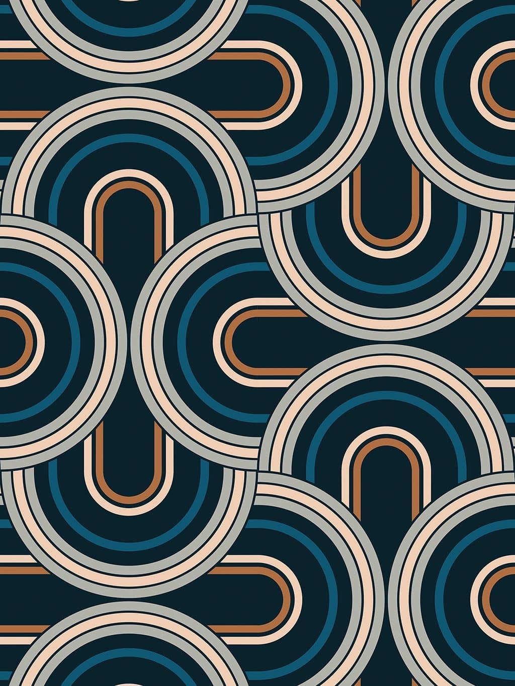
Dancheong is Korean, not uniquely Busan. Gamcheon may connect the print to stacked colour, hillside modules, and city memory.

Open Busan detail
San Francisco wallpaper pattern Alcatraz lighthouse Fresnel lens

San Francisco

Retest
Bay Area surface modernism may beat Fresnel

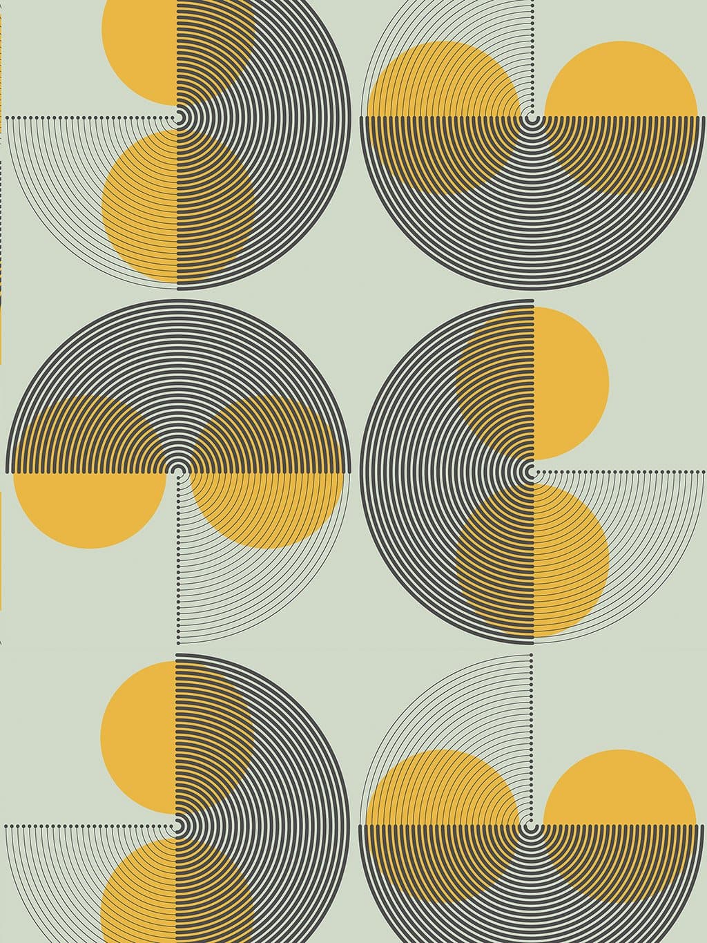
Fresnel is elegant but global. Sea Ranch supergraphics, Asawa loops, or de Young copper screen need a visual test.

Open San Francisco detail

Active Contenders / Small List

Keep these lean. Each needs one convincing image or one better conceptual bridge before it deserves a full story.

Buenos Aires Polesello optical acrylic is the best new lead; Madí can be the wider Buenos Aires frame. Banco de Londres stays out.
Atlanta Portman atrium remains the ok-ish baseline. Need a sharper capsule-elevator, section, or Atlanta-specific loop object to beat it.
York Cocoa Works / Terry's factory window cadence is promising but needs a closer crop. Railway carriage windows stay as backup.
Stockholm Metro tile or Swedish design module is stronger than islands. Avoid cemetery language. Need a closer repeated-module source.
Antwerp Plantin is smarter than Art Nouveau, but only works if we find the modular printed ornament with the curve-and-roundel hook.
Tel Aviv Semi-circular balcony rhythm is promising: rounded corners, shade, civic circles, and facade cadence as one repeated language.

Parked / Do Not Spend Time

These can stay in the archive of thought, but they should not dominate the dashboard unless new visual evidence appears.

Budapest / Copenhagen archived Buenos Aires Banco de Londres Antwerp Art Nouveau / De Roos Atlanta Fox Theatre as lead York lever controls Stockholm cemetery mood Stockholm archipelago-only route Cinema Rif as Tangiers lead Generic Deco category Fileteado without a formal hook Vague port cranes Prison / cell atmosphere

Active Visual Hooks

Fast side-by-side review for the weak or revised candidates before we write anything final.

Tel Aviv — revised, not locked

Tel Aviv wallpaper pattern
Print: cream bands with half-round colour modules.
Dizengoff Circle circular balconies archive photo
Test hook: 1930s Dizengoff Circle circular balconies.
Rounded balconies on Bialik Street in Tel Aviv
Supporting hook: rounded balconies as repeated Tel Aviv language.
Generated Tel Aviv semi-circular rhythm study
Generated bridge: semi-circles carried through as rhythm.

Current note: use the semi-circular rhythm as the thread throughout: circular balconies, rounded corners, shade, facade bays, and civic circle.

LLM Council Shortlist

Filtered hard: discarded weak verbal-only routes, generic city grids, vague port cranes, Fileteado, prison/graveyard mood, and broad architecture with no close visual hook.

Buenos Aires — new best test

Buenos Aires wallpaper pattern
Print: pastel optical beam lattice with small dark voids.
Rogelio Polesello acrylic optical object
Keep: Polesello optical acrylic / lens-object logic.
Carmelo Arden Quin Madí geometric artwork
Keep: Madí cut-frame / constructed-object logic.
Generated Madí structural weave study
Bridge: invented geometry and interlocking planes.

Verdict: only new lead with a real immediate hook. Keep Polesello as the strongest BA test; Madí remains the broader frame. Banco de Londres stays no-pass.

Atlanta — try to beat Portman

Atlanta wallpaper pattern
Print: looped vertical forms with ribbing and split roundels.
Fox Theatre Atlanta Mighty Mo organ console
Probably discard: beautiful arcs, but not closer than Portman.
Atlanta Marriott Marquis atrium
Keep as backup: Portman atrium ribs and vertical circulation.
Generated Atlanta Portman atrium loop study
Bridge: loop, rib, and circular-core grammar.

Verdict: do not replace Portman yet. Fox Theatre is interesting but not obvious enough from the actual image. Keep Atlanta as ok-ish Portman unless a sharper capsule-elevator or section image appears.

York — strongest new leads

York wallpaper pattern
Print: strict pale green vertical panels on black with brown bars.
Terry's Factory in York
Maybe: Cocoa Works / Terry's industrial window cadence, but current image is too distant.
Historic railway carriage at the National Railway Museum
Keep as backup: carriage-window rhythm, not controls.
Five Sisters Window at York Minster
Parked backup: visually close but too expected.

Verdict: not locked. Cocoa Works is conceptually better than lever controls, but needs a close facade/window crop. Rail carriage windows remain the safer visual backup.

Stockholm — replace islands

Stockholm wallpaper pattern
Print: soft repeated modules on a dark modernist ground.
Hötorget metro station in Stockholm
Maybe: Hötorget metro tiles give mood, but the image is not a killer hook.
Generated Stockholm archipelago visual study
Parked: archipelago is poetic but too broad.
Stockholm Public Library rotunda interior
Potential: Asplund library rotunda / repeated interior modules.

Verdict: still unresolved. Metro is stronger than islands as a concept, but not visually obvious enough yet. Need a closer Stockholm textile/design or tile-module reference.

Antwerp — new lead

Antwerp wallpaper pattern
Print: black square cells with teal sweep and rose roundel.
Plantin printer's compass mark in Antwerp
Maybe, not proven: Plantin compass is conceptually good but visually too literal/grand.
Fleuron from Christophe Plantin type specimen
Maybe: real Plantin ornament repetition, but too floral unless abstracted.
Antwerp wallpaper pattern detail
Still need: a modular printed emblem with circle + curve, or discard Plantin.

Verdict: not visually proven. Plantin is smarter than Art Nouveau, but we still need the obvious circle-and-sweep hook. Diamond scaife remains possible only with a strong tool image.

Visible characteristics of the print

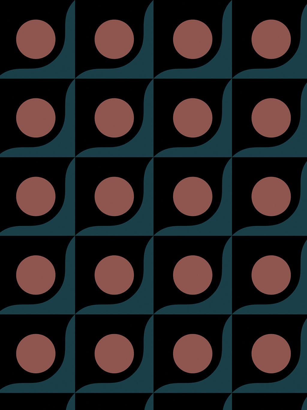
Pale grey-green ground with repeated peach circles, each partly cut by a black segment. Thin diagonal lines run through the field and set the circles into a stepped, slanting cadence. The design is clean and spare: circles, cuts, and diagonal scoring rather than a dense all-over structure.

Visual comparison

Jacquard is probably too far away as the lead. The closer Lyon hook is Lumiere and the birth of cinema: circular reels and lenses, a shutter-like black interruption, and diagonal projection lines moving across a pale ground. The print feels less like woven instruction and more like a quiet optical machine.

Lyon wallpaper pattern
Lyon print

Peach circles with black cut-outs, diagonal guide lines, soft grey-green ground.

Lumiere cinematograph projector
Lumiere cinematograph

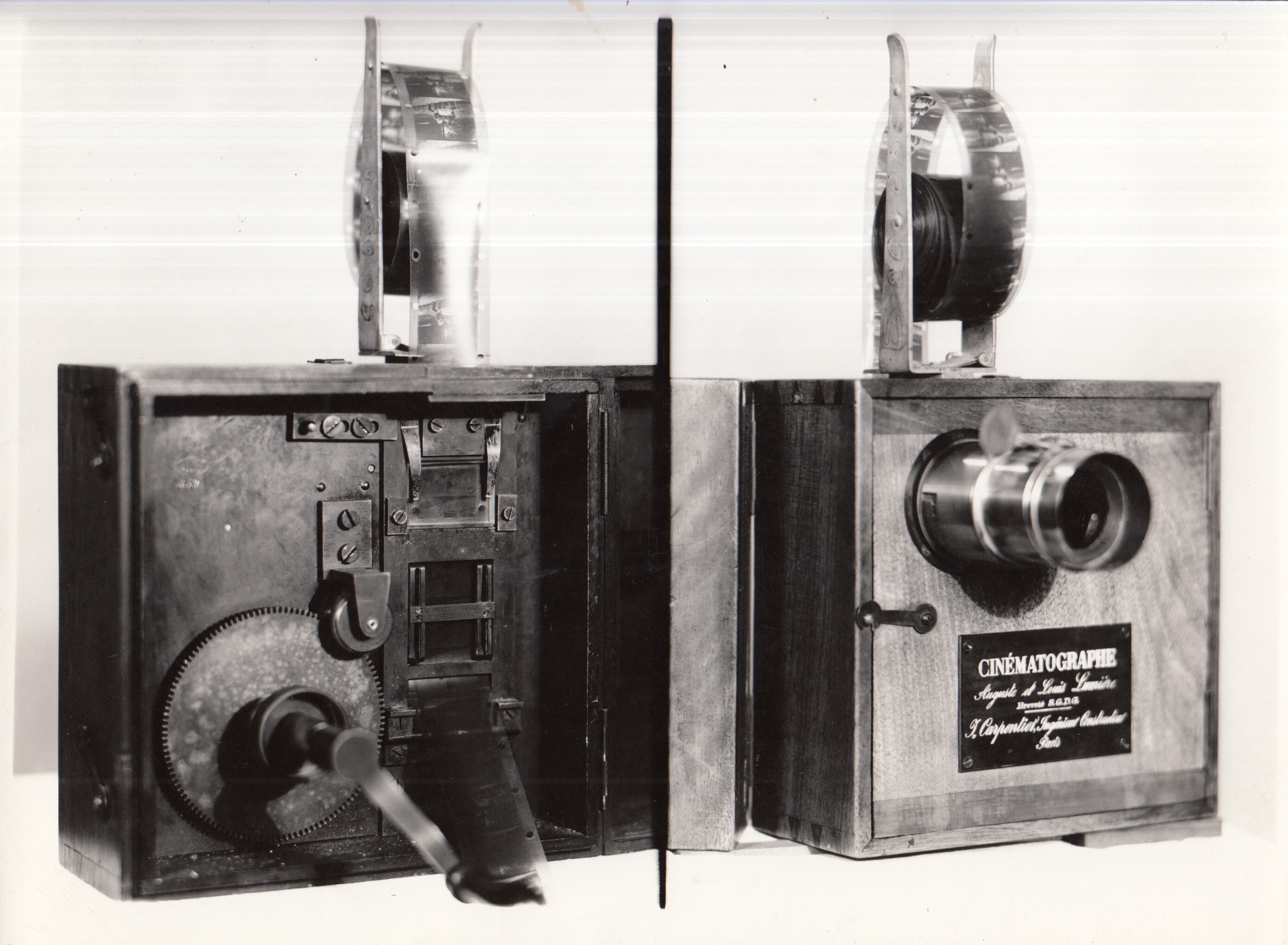
Real reference: lens, reels, shutter mechanics, black casing, and early projection apparatus.

Generated Lyon Lumiere projection rhythm study
Generated bridge study

Fabricated review image: reels, shutter cuts, and projection lines pushed toward the print's rhythm.

Jacquard loom punch cards
Jacquard backup

Real reference: still city-specific, but visually more distant than the Lumiere / optical route.

Direction 2

Working title
Jacquard card afterimage
Source idea
Lyon's silk and Jacquard history, especially punched cards as a way of turning pattern into a readable sequence of holes, rows, absences, and instruction.
Why it fits visually
The circles can carry a punched-card memory and the diagonal lines can become a programmed score, but the scale and softness of the circles feel less convincing than the Lumiere route.
Research leads to investigate
Maison des Canuts; Lyon silk industry; Joseph Marie Jacquard; punched-card loom; silk weaving notation; early pattern programming.
Strength of direction
Backup, visually possible but distant
Risks / weaknesses
Can sound clever while asking the image to travel too far. Keep only if Lumiere fails.

Direction 3

Working title
Traboule passage markers
Source idea
Lyon's traboules: covered passages, thresholds, courtyards, and hidden routes through the city fabric.
Why it fits visually
The diagonal lines could become routes and the circles could become court markers, but this asks the print to behave more like a map than it actually does.
Research leads to investigate
Vieux Lyon traboules; Croix-Rousse passages; passage maps; courtyard thresholds.
Strength of direction
Weak backup
Risks / weaknesses
Too geographic and not enough object-specific at the moment.

Recommended direction

Lumiere projection afterimage. This is a stronger candidate than Jacquard because it uses what the print actually shows: discs, shadow cuts, diagonal optical movement, and a calm mechanical rhythm. It is Lyon-specific without forcing silk history onto a pattern that does not quite behave like weaving.

Uncertainty / not verified

Repeat measurement not verified. Exact official colour taxonomy not verified. Direct Jupiter10 design intent not verified. Lumiere route is a concept hypothesis, not a factual origin claim.

Visible characteristics of the print

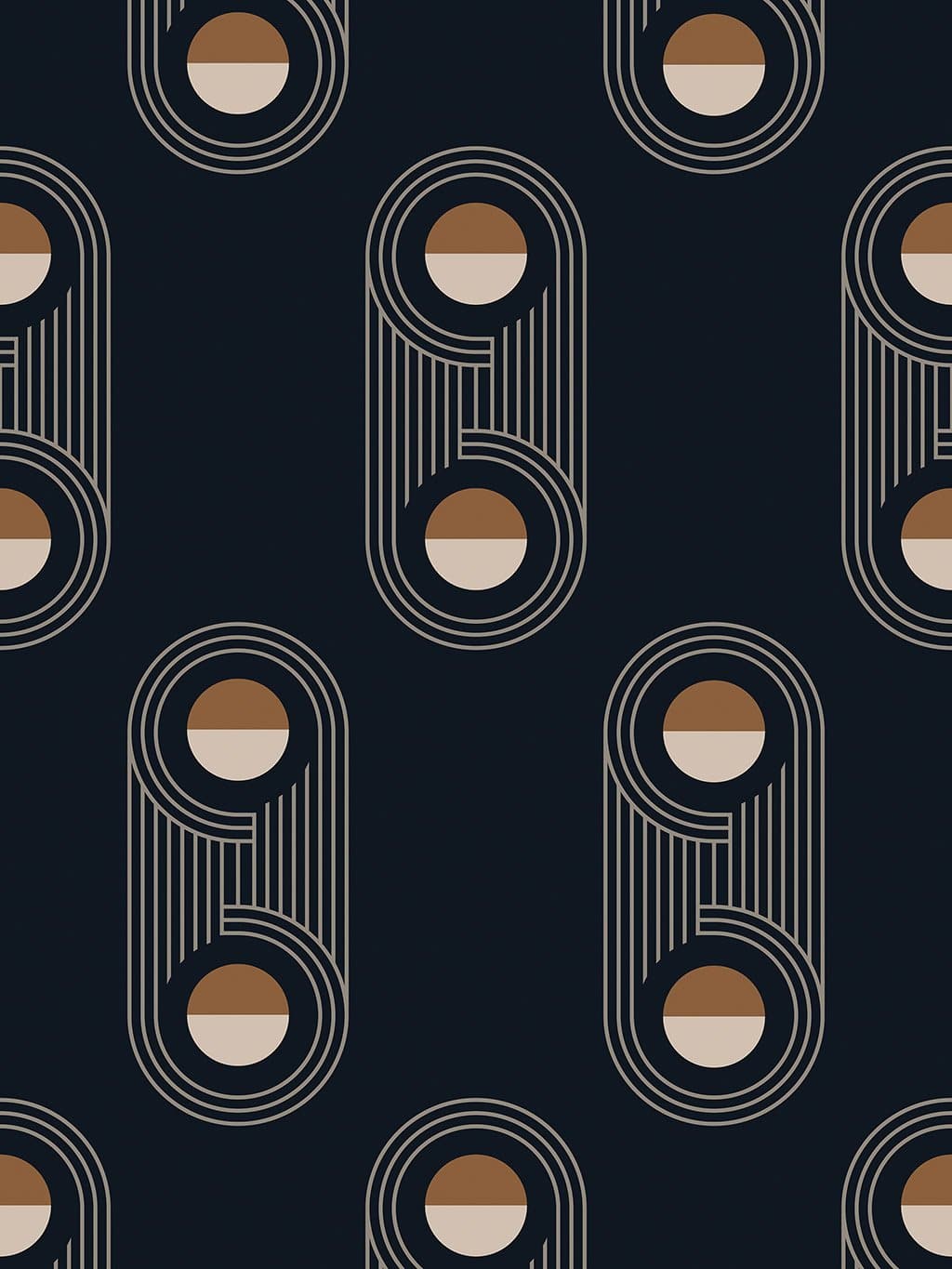
Dark navy ground with repeated tall looped forms. Each motif is made from nested cream linework, vertical bars, and circular inserts split between warm brown and pale cream. The rhythm is upright and spacious, with the motifs sitting apart rather than forming a continuous stripe.

Visual comparison

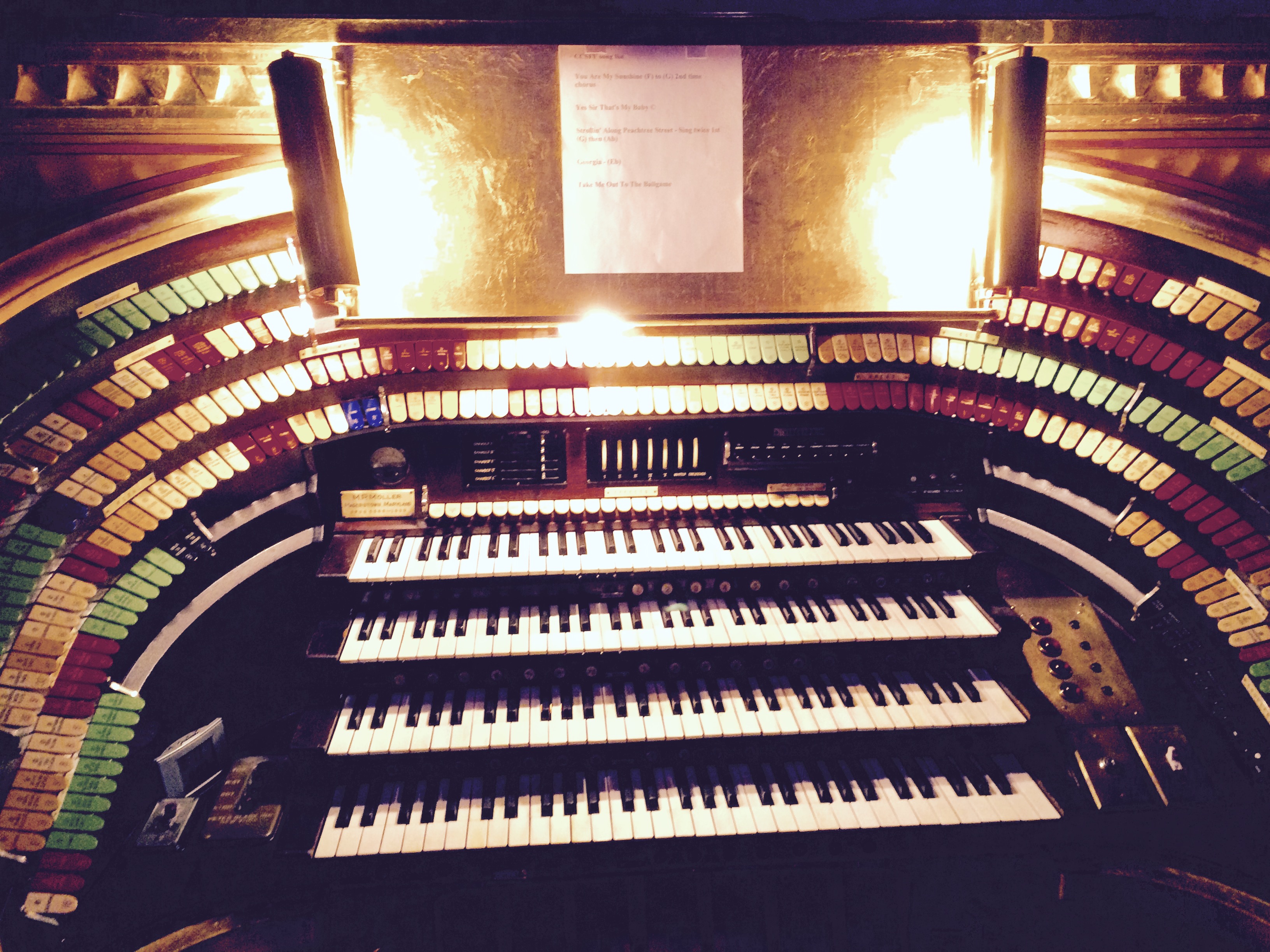
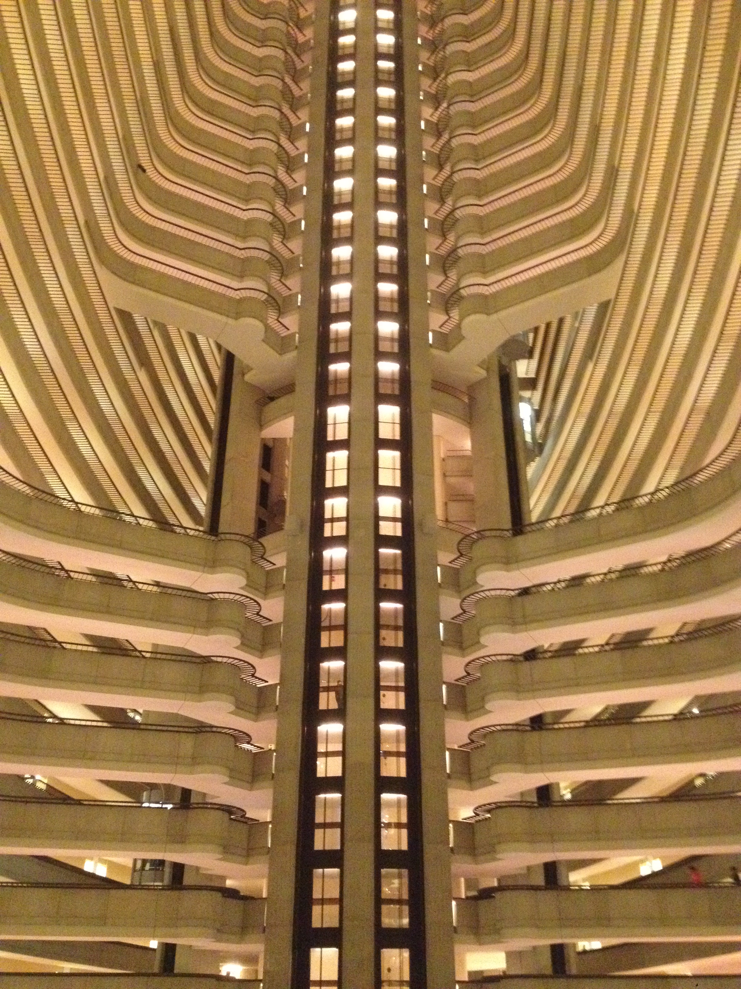
The Atlanta hook remains John Portman's atrium language, but it is not locked as a wow route. It gives a believable structure: long vertical voids, stacked balconies, elevator shafts, and rounded internal edges. The print can carry the memory of looking up inside a downtown atrium, where loops, ribs, and circular elevator cores become a repeating wall rhythm.

Atlanta wallpaper pattern
Atlanta print

Tall looped motifs, nested lines, vertical ribs, circular warm/pale inserts.

Atlanta Marriott Marquis atrium
Marriott Marquis atrium

Real reference: stacked balconies, vertical rise, central shaft, and curved internal ledges.

Atlanta Marriott Marquis elevator and atrium view
Elevator / atrium view

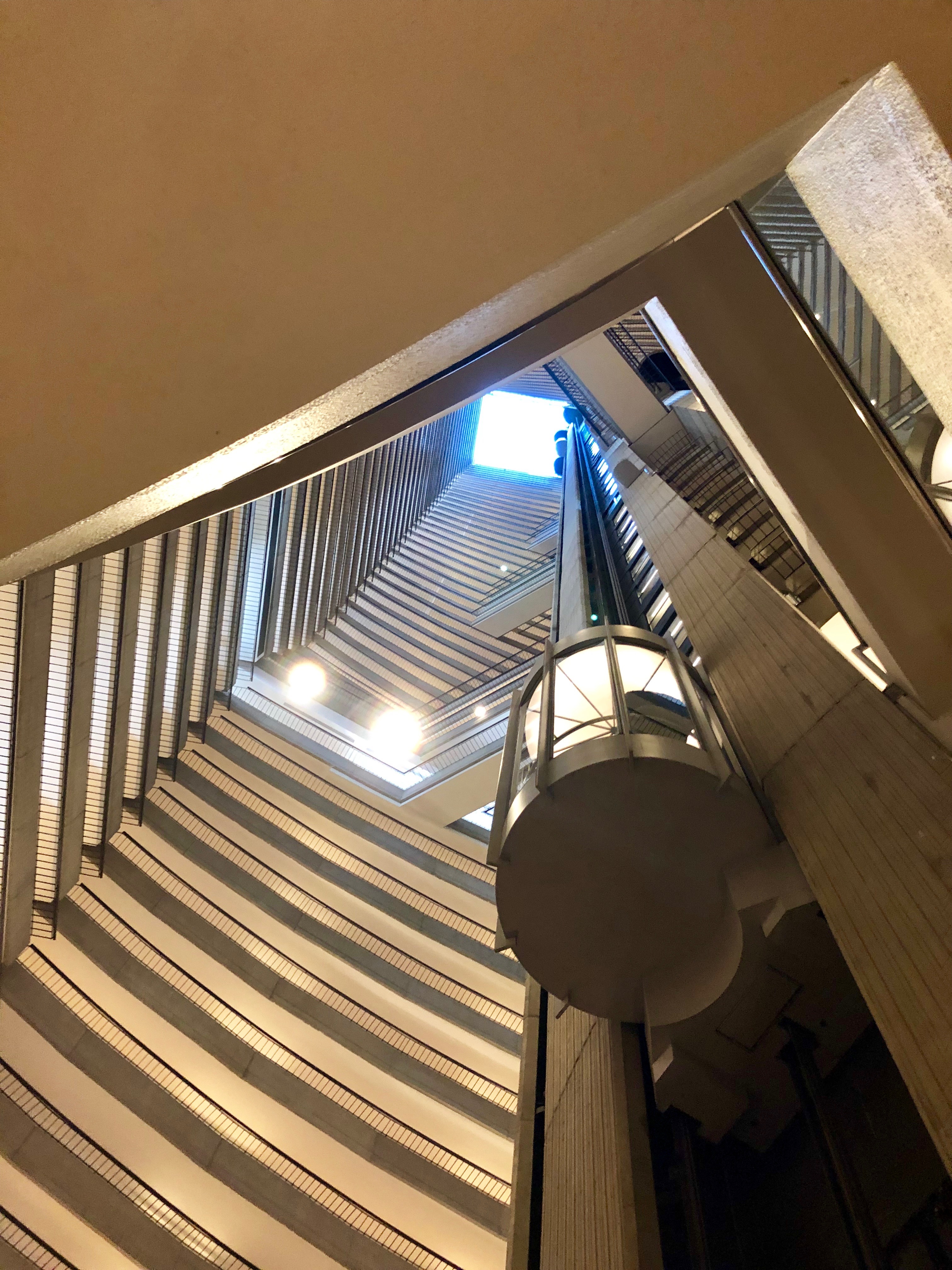
Real reference: cylindrical elevator core, vertical ribs, open height, and repeated balcony edges.

Generated Atlanta Portman atrium loop study
Generated bridge study

Fabricated review image: Portman atrium loops reduced into nested linework and circular cores.

Direction 2

Working title
MARTA tunnel signage
Source idea
Transit circles, route loops, station portals, and dark underground wayfinding in Atlanta's MARTA system.
Why it fits visually
The loops and dark ground can support a transport reading, but the print has too much architectural height for this to be the best lead.
Research leads to investigate
MARTA station signage; Five Points station; transit maps; platform lighting.
Strength of direction
Backup
Risks / weaknesses
Could feel generic because many cities have circular transit graphics.

Direction 3

Working title
Fox Theatre interior arches
Source idea
Atlanta's Fox Theatre: layered arches, warm interior colour, dark theatrical enclosure, and repeated ornamental frames.
Why it fits visually
The arch forms and warm circular inserts could connect, but the product is cleaner and more modernist than the theatre reference.
Research leads to investigate
Fox Theatre auditorium arches; lobby details; proscenium and lighting forms.
Strength of direction
Weak backup
Risks / weaknesses
May pull the story into ornament and away from the print's ordered modernist character.

Recommended direction

Portman atrium loops, for now. This is visually defensible: the print's nested loops, vertical ribs, and circular cores speak in atrium language. It gives Atlanta a genuine design-led origin, but it is not yet at the level of Prague or Athens. Keep it as the current best while we allow a better Atlanta object to surface.

Uncertainty / not verified

Repeat measurement not verified. Exact official colour taxonomy not verified. Direct Jupiter10 design intent not verified. Portman route is a concept hypothesis, not a factual origin claim.

Visible characteristics of the print

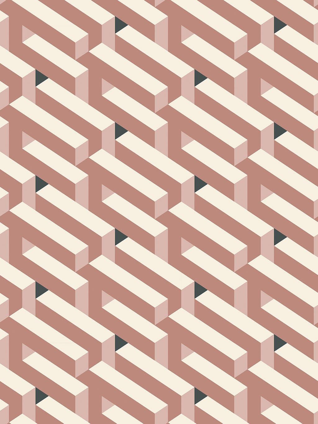
Interlocking cream and dusty rose forms create a repeated three-dimensional weave. The shapes read as beams, frames, and folded blocks, with small dark triangular voids appearing where the structure opens. The surface is ordered, architectural, and optical, built from repeated mass and gap.

Visual comparison

Banco de Londres is now parked. The better Buenos Aires test is Argentine geometric abstraction: Madí and Arte Concreto-Invención, where shaped frames, interlocking planes, polygons, relief objects, and invented structures were treated as art in themselves. This is closer to the print's impossible-beam logic than the building reference.

Buenos Aires wallpaper pattern
Buenos Aires print

Dusty rose and cream interlocking beams with repeated dark voids.

Carmelo Arden Quin geometric Madí artwork
Arden Quin / Madí object

Real reference: irregular frame, geometric planes, object-painting logic, and playful structural invention.

Martin Blaszko Proyecciones urbanisticas geometric sculpture
Martin Blaszko at MALBA

Real reference: open geometric frames, angled supports, urban projection, and sculpture as constructed drawing.

Generated Buenos Aires Madí structural weave study
Generated Madí bridge

Fabricated review image: cut-frame geometry pushed toward the print's dusty rose, cream, and dark void system.

Banco de Londres concrete aperture facade
Banco de Londres backup

Rejected for now: strong building, but the reference still does not explain the print with enough surprise or closeness.

Direction 2

Working title
Banco de Londres structural weave
Source idea
The former Banco de Londres y America del Sur by Clorindo Testa and SEPRA: brutalist frame, deep apertures, concrete mass, and spatial crossings.
Why it fits visually
The cream bars can read as structural beams and the dark gaps as shadowed apertures, but the actual reference still feels too heavy and too literal beside the print's optical, pastel structure.
Research leads to investigate
Banco de Londres / Banco Hipotecario; Clorindo Testa; SEPRA; brutalist Buenos Aires; facade apertures.
Strength of direction
No pass for now
Risks / weaknesses
Good idea in theory, weak as the main visual story. Keep as discarded research unless a much closer building detail appears.

Direction 3

Working title
Teatro San Martin stage machinery
Source idea
Buenos Aires modernist theatre architecture: stacked backstage systems, gridded interiors, fly towers, and abstract scenic construction.
Why it fits visually
The print has a constructed, stage-set quality, with repeated beams and hidden voids. It could support a theatre-machine story if stronger imagery is found.
Research leads to investigate
Teatro General San Martin; theatre section drawings; backstage grids; modernist interiors.
Strength of direction
Backup to research
Risks / weaknesses
Currently lacks a single killer visual reference.

Recommended direction

Madí cut-frame architecture. This is the better next test. It keeps Buenos Aires in a real modernist/concrete-art world and explains the print through invented geometry, cut frames, interlocking planes, and object-like structure. Banco de Londres is parked as no pass for now.

Uncertainty / not verified

Repeat measurement not verified. Exact official colour taxonomy not verified. Direct Jupiter10 design intent not verified. Madí / Arte Concreto route is a concept hypothesis, not a factual origin claim. Banco de Londres is no pass for now.

Visible characteristics of the print

Deep black square modules repeat in a strict grid. Each cell carries a teal curved sweep along one edge and a muted rose circle held inside the dark field. The design is not a dot pattern alone; it is a tiled curve-and-roundel system, with the circle and the curling teal form acting together.

Visual comparison

Antwerp is parked. The tile / Art Nouveau and De Roos routes have partial visual relationships, but neither creates the immediate hook needed for a believable Print Story foundation. Keep these notes only as discarded research unless a much stronger visual object appears.

Antwerp wallpaper pattern
Antwerp print

Black tile cells, teal curling forms, rose circular roundels, repeated modular order.

Antwerp-area Art Nouveau floor tile reference
Antwerp-area tile floor

Real reference, rights not cleared: reclaimed Belle Epoque floor near Antwerp with curves, pink/green/black palette, and four-tile tessellation logic.

De Roos Art Nouveau house in Antwerp
De Roos house

Real reference: Antwerp, Cogels-Osylei 46. The rose/canopy idea is more specific than broad Art Nouveau, but still needs scrutiny.

Jules Hofman Art Nouveau door detail in Antwerp
Jules Hofman doorway

Real reference: Antwerp Art Nouveau threshold language, curved frames, dark joinery, and decorative enclosure.

Generated Antwerp Art Nouveau tile visual study
Generated bridge study

Fabricated review image: Antwerp tile curves and roundels pushed toward the print's teal, black, and rose system.

Direction 2

Working title
Port buoy and river bend
Source idea
Antwerp as port city: dark water, harbour markers, curved quays, circular buoys, and industrial colour glimpsed as simple signals.
Why it fits visually
The rose circles and teal curves can become signal marks on a dark water field, but the evidence is looser than the tile route.
Research leads to investigate
Port of Antwerp; Scheldt river curves; dock signage; harbour buoys; old port maps.
Strength of direction
Backup
Risks / weaknesses
Could feel invented unless a very strong visual reference appears.

Direction 3

Working title
Antwerp fashion graphic
Source idea
A design-culture route through Antwerp's fashion city identity: graphic restraint, repeated forms, and unexpected colour.
Why it fits visually
The pattern has the clarity of a textile repeat, but the name-to-place logic is too abstract at this stage.
Research leads to investigate
MoMu archives; Antwerp Six graphic textiles; Belgian fashion prints.
Strength of direction
Weak backup
Risks / weaknesses
Too brand/culture-led without a specific visual object.

Recommended direction

Parked. The Zurenborg tile story is too weak, and De Roos does not convince as a visual hook. Do not develop Antwerp until a stronger, more immediate source is found.

Visible characteristics of the print

Cream ground divided into vertical bands. Large half-circles and quarter-circles sit against the band edges in navy, caramel brown, grey, black, and dark green. The rhythm is clean, architectural, and modular, with rounded forms interrupting a very disciplined rectangular order.

Visual comparison

The generic White City balcony route was too weak when treated as one loose reference. The stronger logic is a repeated Tel Aviv semi-circular grammar: Dizengoff Circle's circular balconies, Bialik-area rounded balconies, curved corner buildings, shade-making balcony fronts, and the civic circle itself. The print can carry that rhythm through the whole surface rather than pointing to one facade.

Tel Aviv wallpaper pattern
Tel Aviv print

Cream bands, half-round colour forms, dark shadow modules, caramel and slate blocks.

Rounded balconies on Bialik Street in Tel Aviv
Bialik rounded balconies

Real reference: round balcony edges, cream facade, repeated curved shadows.

Dizengoff Circle circular balconies in Tel Aviv
Dizengoff Circle archive

Real public-domain reference: 1934-1939 circular balconies, stronger and more specific than the generic balcony route.

Generated Tel Aviv semi-circular rhythm visual study
Semi-circular rhythm study

Fabricated review diagram: half-round balcony, rounded corner, and print module treated as one repeat language.

Max Liebling House in Tel Aviv
Max Liebling House

Real reference: White City modernism, recessed openings, rounded internal details, cream architecture.

Generated Tel Aviv Bauhaus balcony visual study
Generated bridge study

Fabricated review image: half-round balconies and sun shadows translated into the print's modular circle/band system.

Direction 2

Working title
Dizengoff Circle fragments
Source idea
Dizengoff Square / Circle as a round urban form, with curved balconies and a circular civic plan broken into architectural fragments.
Why it fits visually
The print's repeated half-rounds could come from a circle cut by streets, building edges, and balcony arcs.
Research leads to investigate
Dizengoff Circle; Genia Averbuch; Bauhaus Center Tel Aviv; archival plans/photos.
Strength of direction
Strong backup
Risks / weaknesses
Needs a good visual reference; otherwise direction 1 is cleaner and more direct.

Direction 3

Working title
Sunshade and shadow grammar
Source idea
Climate-driven modernism: balconies, brise-soleil, recessed windows, and shadow as ornament across white facades.
Why it fits visually
The coloured half-circles can be treated as shadows moving across cream architectural bays.
Research leads to investigate
Tel Aviv climate adaptation; balconies for shade and ventilation; White City conservation notes.
Strength of direction
Good supporting layer
Risks / weaknesses
Works best as supporting explanation, not the whole origin story.

Recommended direction

Revised best test: semi-circular balcony rhythm. Use Dizengoff Circle as the anchor, then carry the half-round language through Bialik/Shlomo Hamelech rounded balconies, curved corner buildings, shade, and facade bays. Stronger than a single-image story, but still review side by side before locking.

Visible characteristics of the print

Black ground with repeated pale green vertical rectangles arranged in clean rows. Narrow black intervals separate each upright panel, while short brown vertical bars sit between bands. The pattern is strict and rhythmic, but it can be softer than a control panel: more like windows, compartments, platforms, and repeated journeys.

Visual comparison

The rail connection is worth keeping, but the logic is better through carriage-window and station-hall rhythm than through controls. The print can be read as a stripped railway side elevation: repeated panes, dark intervals, brown framing, and greenish glass. It gives York a rail memory without making the wallpaper feel like machinery.

York wallpaper pattern
York print

Pale green verticals, black intervals, brown markers, repeated window cadence.

Historic railway carriage at the National Railway Museum in York
Carriage-window rhythm

Real reference: repeated panes, dark framing, warm trim, journey and compartment structure.

York railway station train shed
Station shed support

Real reference: glass, iron, platforms, dark roof, repeated vertical and arched station rhythm.

Generated York carriage-window visual study
Generated bridge study

Fabricated review image: carriage windows reduced into the print's green/brown/black order.

NRM Central lever frame at the National Railway Museum in York
Controls backup

Good rail evidence, weak main logic. Keep only as a secondary rhythm reference.

Five Sisters Window at York Minster
Five Sisters backup

Visually valid, but more expected and more ecclesiastical than the rail route.

Direction 2

Working title
Signal-frame cadence
Source idea
York railway control through NRM Central, signal boxes, lever frames, and block instruments.
Why it fits visually
The intervals and upright elements fit, but the story feels too equipment-led for the print.
Research leads to investigate
Keep as secondary rail evidence only.
Strength of direction
Backup only
Risks / weaknesses
Too technical and emotionally narrow as a PDP story.

Direction 3

Working title
Five Sisters lancet memory
Source idea
The Five Sisters Window in York Minster: tall lancets of grisaille glass reduced into modern vertical panes.
Why it fits visually
Still visually valid: pale green verticals, dark divisions, repeated height. But it is a more expected York route.
Research leads to investigate
York Minster Five Sisters Window; grisaille glass; lancet window.
Strength of direction
Backup
Risks / weaknesses
Can become too ecclesiastical or too literal.

Recommended direction

Not locked yet. New best test: Carriage-window rhythm. Keep York rail, but make the rail memory about windows, compartments, station sheds, and journeys rather than control levers. Controls and Five Sisters stay as backups.

Visible characteristics of the print

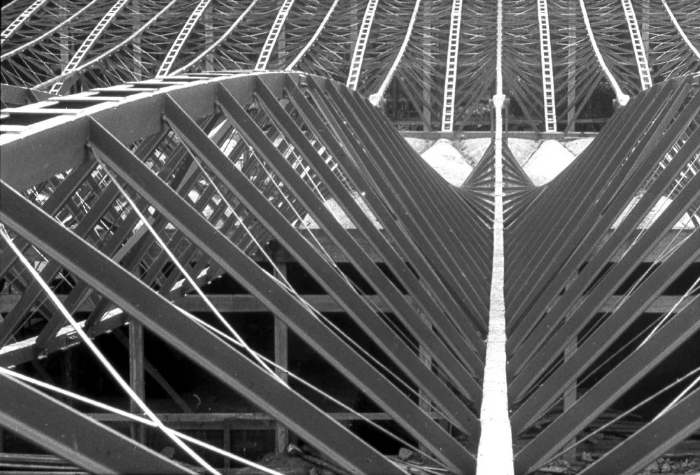
Black ground with a repeated tessellation of triangular folded forms. Teal, dark green, olive, and pale blue planes meet at sharp points, creating a roof-like sequence of pyramids, valleys, and prisms. The surface is precise, dimensional, and highly architectural.

Visual comparison

Warsaw's strongest hook is the vanished Supersam supermarket roof: a post-war modern structure known for its dramatic hanging roof and pleated geometry. The wallpaper's folded triangular planes can be read as a colour-memory of that roof system, translated from black-and-white structure into teal, olive, dark void, and pale blue light.

Warsaw wallpaper pattern
Warsaw print

Tessellated triangular planes, dark voids, teal/olive folds, pale blue openings.

Warsaw Supersam roof interior reference
Supersam roof

Real reference, rights not cleared: pleated roof planes, structural rhythm, dark-light folds.

Warsaw Supersam structural diagram
Structural diagram

Real reference: hanging roof logic and engineering system as a source for folded composition.

Generated Warsaw Supersam folded roof visual study
Generated bridge study

Fabricated review image: Supersam folds pushed toward the print's triangular colour system.

Direction 2

Working title
Polish constructivist prisms
Source idea
A Warsaw art route through constructivist and post-constructivist geometry: sharp planes, triangles, abstract spatial composition, and graphic modernism.
Why it fits visually
The print has a strong abstract-prismatic language, and Warsaw has credible modernist art links.
Research leads to investigate
Henryk Stażewski; Polish constructivism; Museum of Modern Art Warsaw archives; interwar geometric abstraction; poster design.
Strength of direction
Strong backup
Risks / weaknesses
Broader and less surprising than Supersam unless tied to one specific artwork or archive object.

Direction 3

Working title
Reconstruction roofscape
Source idea
Warsaw rebuilt as a city of roofs, planes, scaffolds, and reconstructed silhouettes, abstracted into a folded roofscape.
Why it fits visually
The pattern can read as repeated roof peaks and deep shadow, with pale blue triangular openings as sky.
Research leads to investigate
Post-war Warsaw reconstruction; Old Town rooflines; rebuilt civic architecture; archival city models.
Strength of direction
Medium
Risks / weaknesses
Can get generic and sentimental. Supersam is sharper and more design-led.

Recommended direction

Locked: Supersam pleated roof. It is the strongest Warsaw lead. It is local, modernist, visually close, and carries a useful emotional charge because the building is gone: the print can become a remembered roof structure rather than a generic geometric pattern.

Visible characteristics of the print

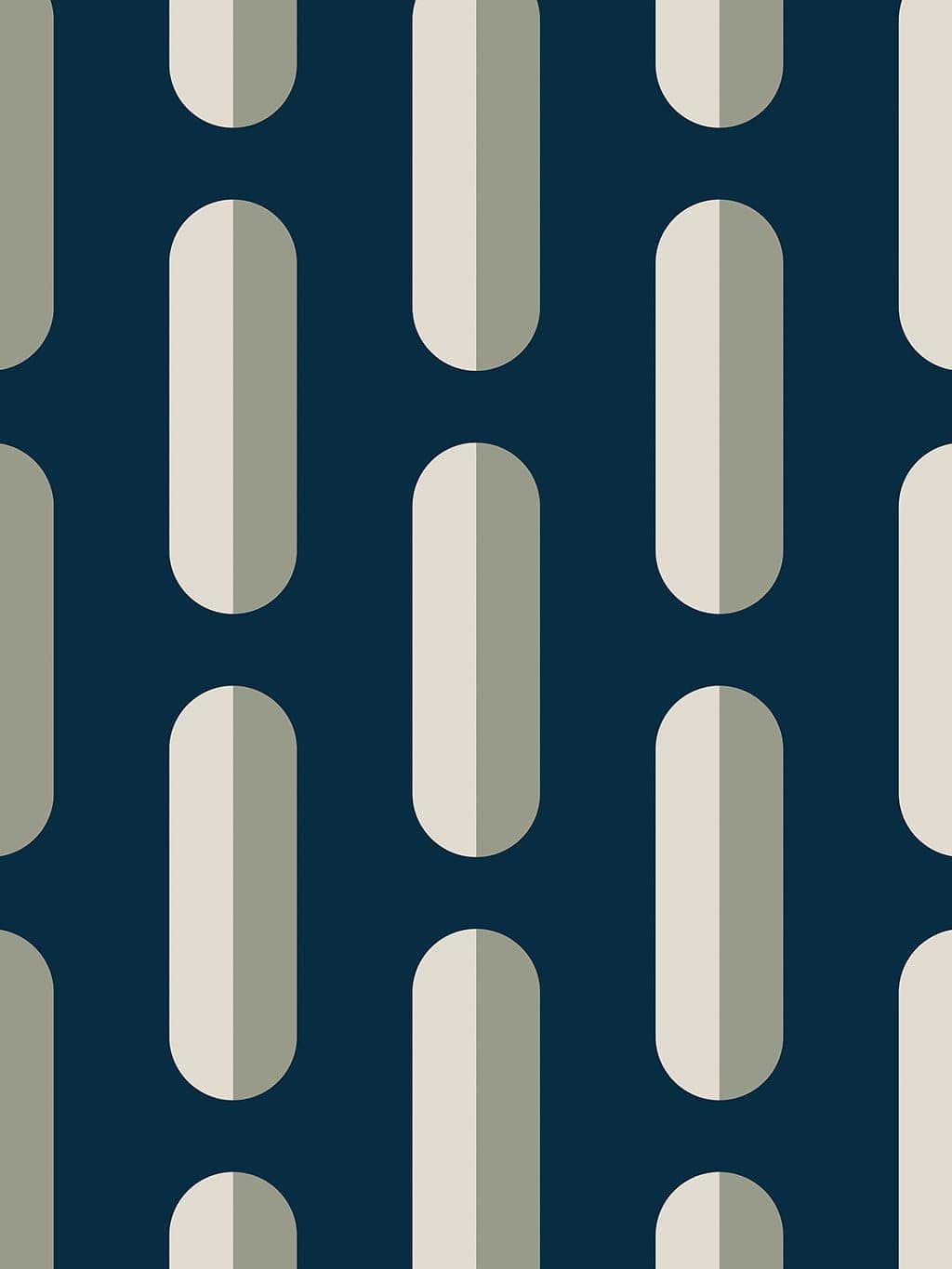
Dark navy-blue ground with staggered vertical capsule forms. Each capsule is split into pale cream and muted sage halves, with longer and shorter rounded columns placed in a strict but softened rhythm. The pattern reads like floating landforms, mooring marks, or elongated islands held in dark water.

Visual comparison

The stronger, more livable Stockholm test is the archipelago: elongated islands, pale shorelines, green interiors, and dark water. It keeps the visual strength of the previous landscape idea without asking the customer to live with a cemetery reference. The product can become a memory of water, routes, and islands rather than a memorial field.

Stockholm wallpaper pattern
Stockholm print

Staggered vertical capsules, cream/sage split faces, dark blue-green ground.

Aerial view of islands in the Stockholm archipelago
Archipelago aerial

Real reference: dark water, green islands, pale shorelines, scattered spacing.

Generated Stockholm archipelago island visual study
Generated bridge study

Fabricated review image: elongated islands translated into the print's capsule rhythm.

Rows of grave markers at Woodland Cemetery in Stockholm
Rejected / research note

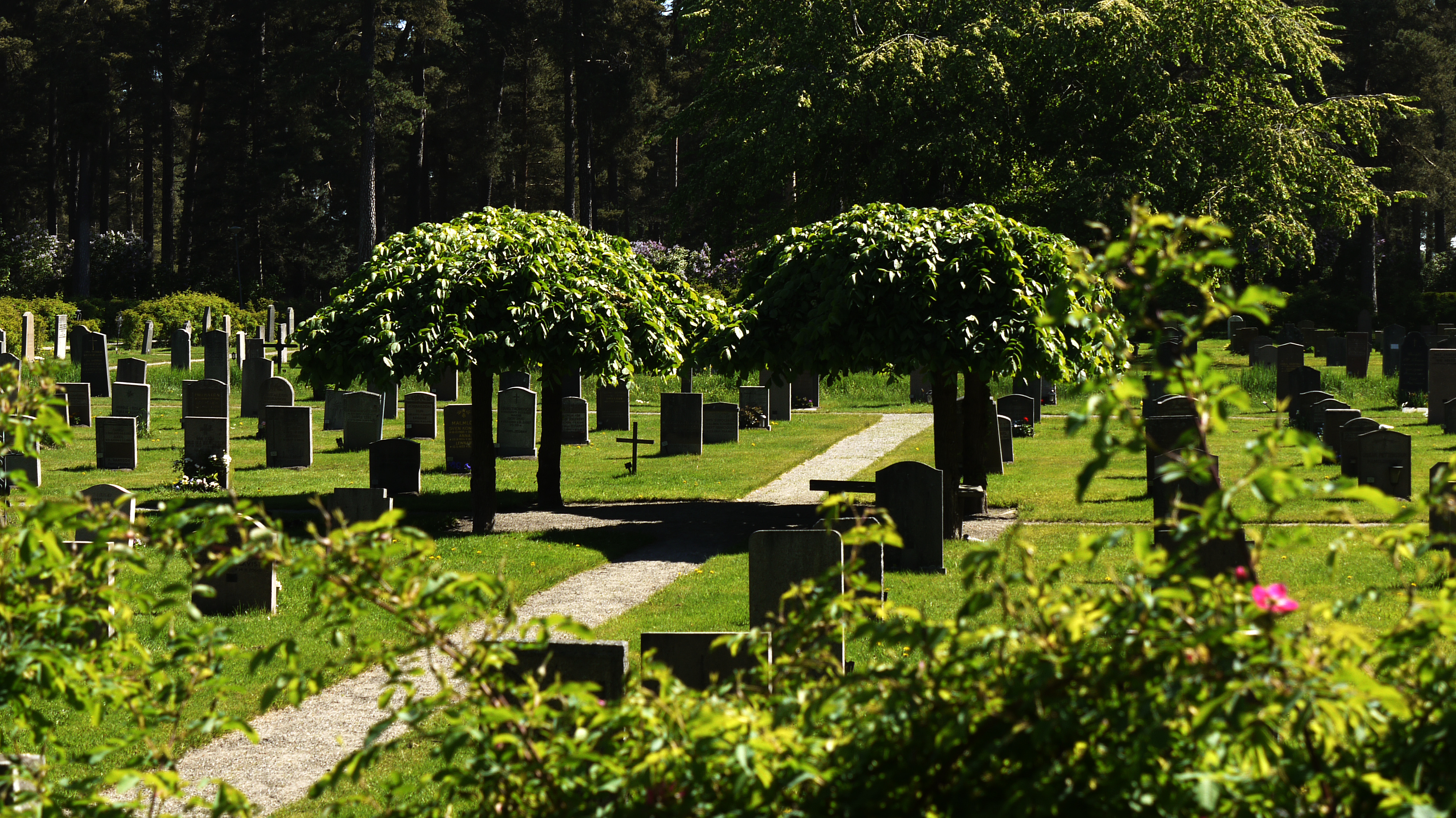
Visual logic was strong, but the room-world is wrong for wallpaper. Do not use as main story.

Stockholm Public Library children's area with oval wall openings
Library oval backup

Useful architectural detail, but smaller and less emotionally open than the archipelago route.

Direction 2

Working title
Asplund's oval warm-air openings
Source idea
A small detail inside Stockholm Public Library's children's area: barred oval openings set beside the stair.
Why it fits visually
The rounded vertical forms and pale/sage split surfaces still connect, but the source is a detail rather than a world.
Research leads to investigate
Stockholm Public Library children's library; Nils Sjogren details; Asplund interiors; warm-air oval openings.
Strength of direction
Backup
Risks / weaknesses
Good visual detail, weaker emotional and spatial range.

Direction 3

Working title
Woodland Cemetery marker field
Source idea
Skogskyrkogarden by Asplund and Lewerentz, tested through vertical markers and green/dark landscape.
Why it fits visually
The spacing and vertical marker logic fit, but the association is not desirable for a domestic wallpaper page.
Research leads to investigate
Keep only as visual research, not as PDP foundation.
Strength of direction
Rejected as main story
Risks / weaknesses
Strong visually, wrong emotionally and commercially.

Recommended direction

Pinned weak choice: Archipelago island rhythm. Keep it visible as the best Stockholm route for now, but do not lock it. It solves the room-world problem better than the graveyard reference, yet still needs a sharper, more surprising Stockholm memory before final PDP writing.

Visible characteristics of the print

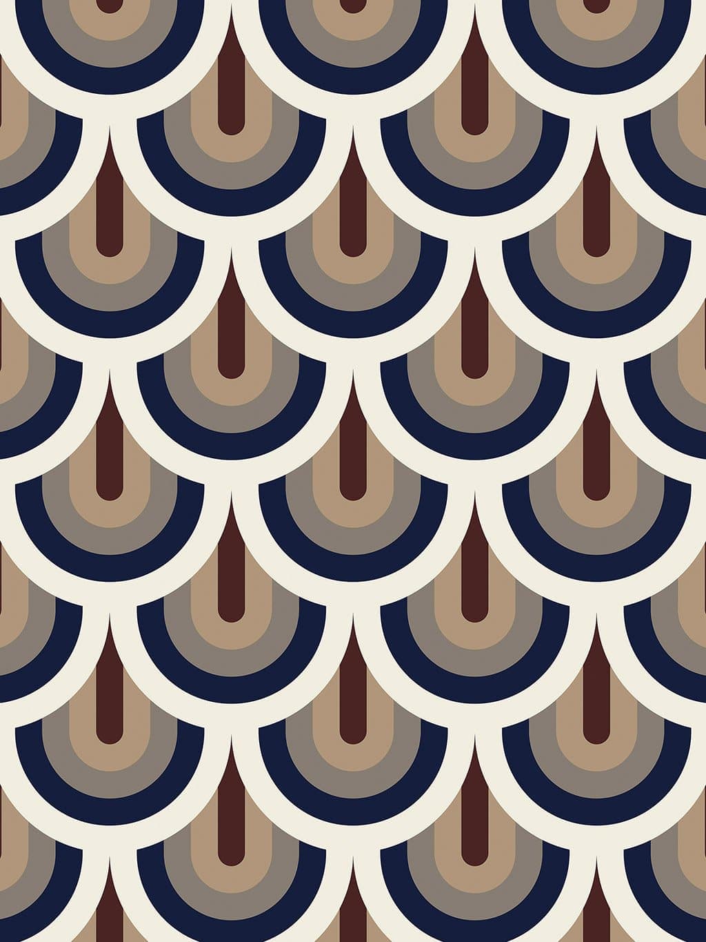
Repeating nested semi-circular motifs arranged in vertical columns. Cream arcs carry dark navy, taupe, warm beige, grey, and burgundy details. The central burgundy form reads like a narrow vertical drop, keyhole, or stylised pendant. The overall rhythm is rounded, ornamental, and architectural, with repeated half-circles creating a scalloped wall field.

Visual comparison

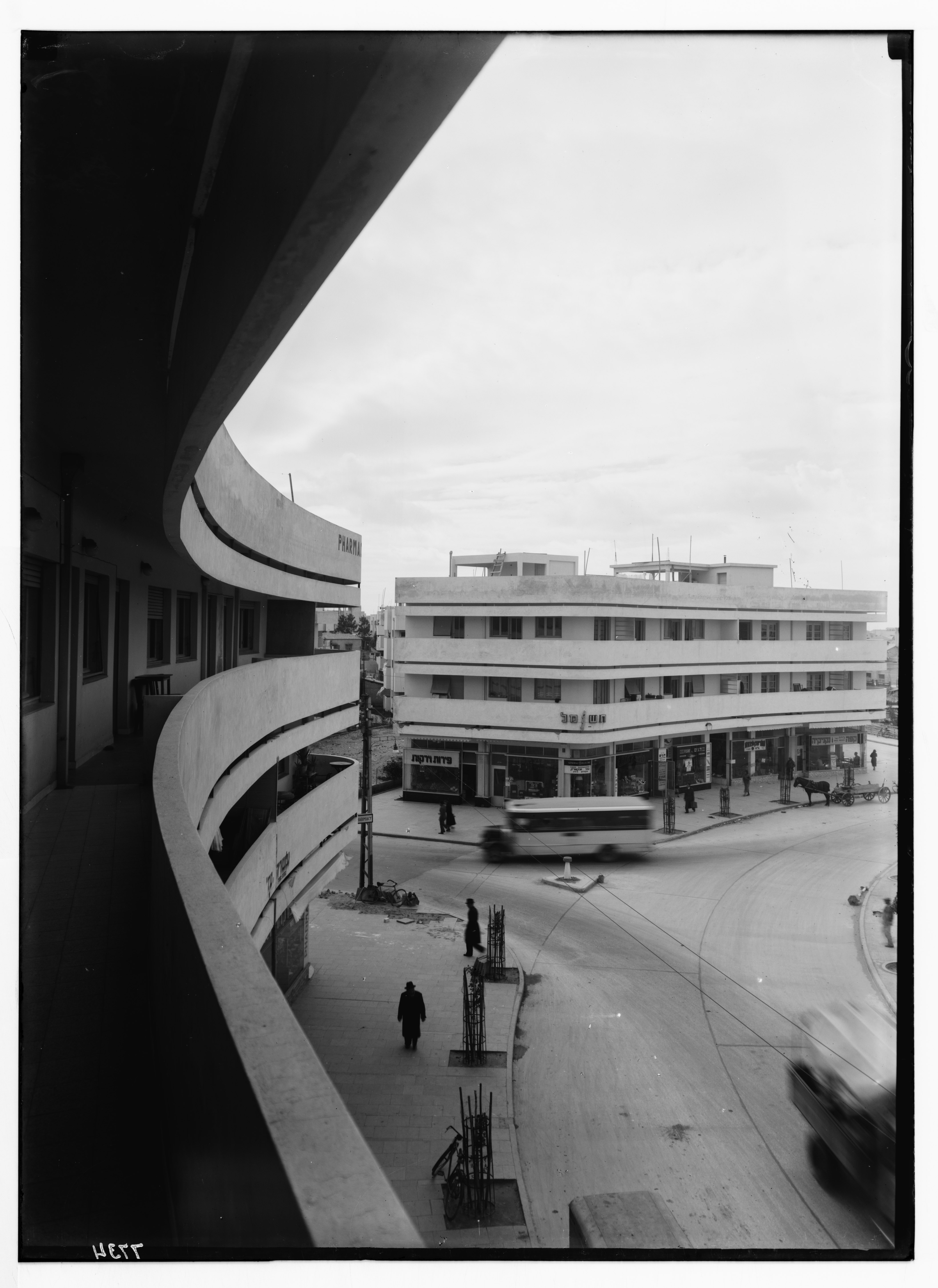
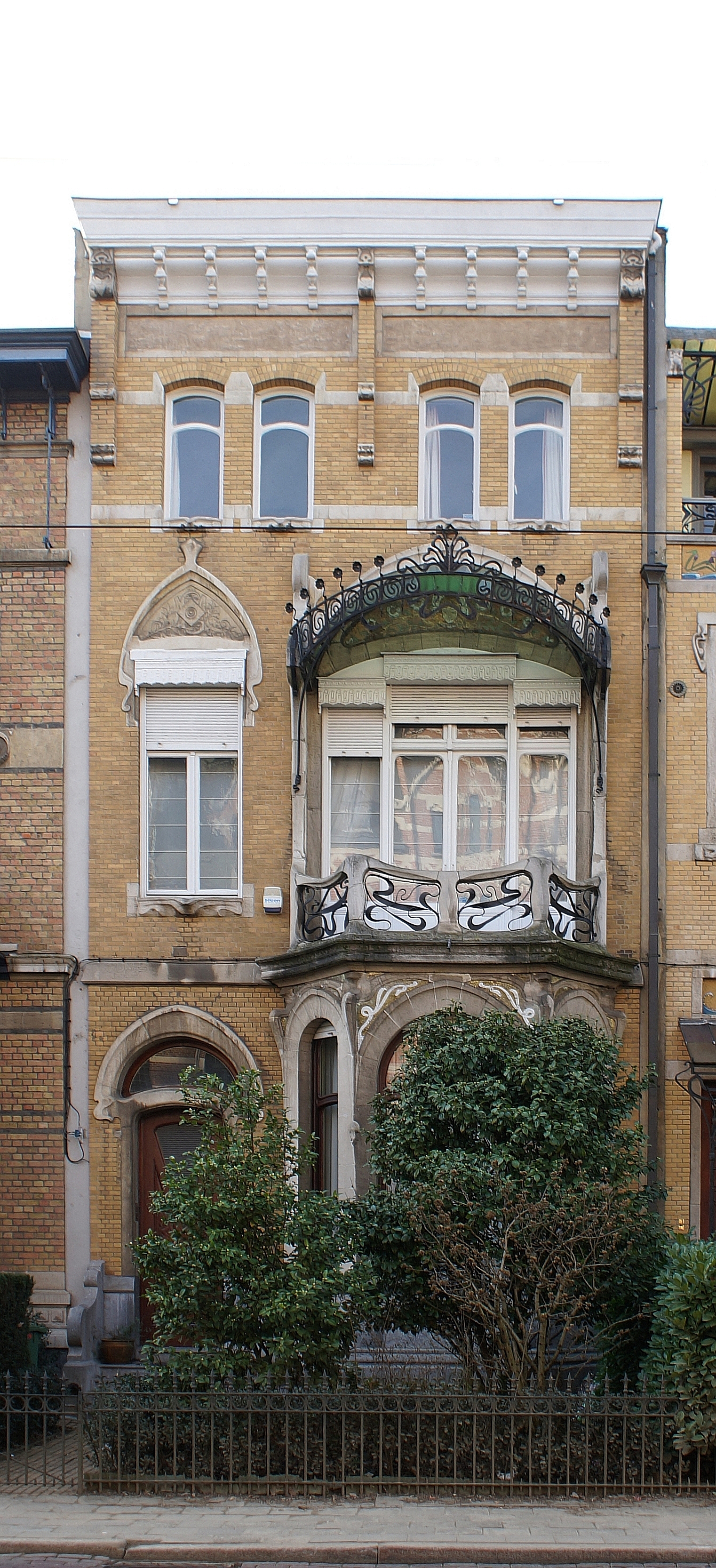
The strongest relationship is not just "Prague has architecture"; it is specifically the way Rondocubism makes round ornament architectural. The print's nested arcs and pendant-like vertical drops sit close to that language.

Prague wallpaper pattern
Prague print

Nested cream arcs, navy bands, taupe centres, burgundy vertical drops.

Legiobanka facade in Prague
Legiobanka facade

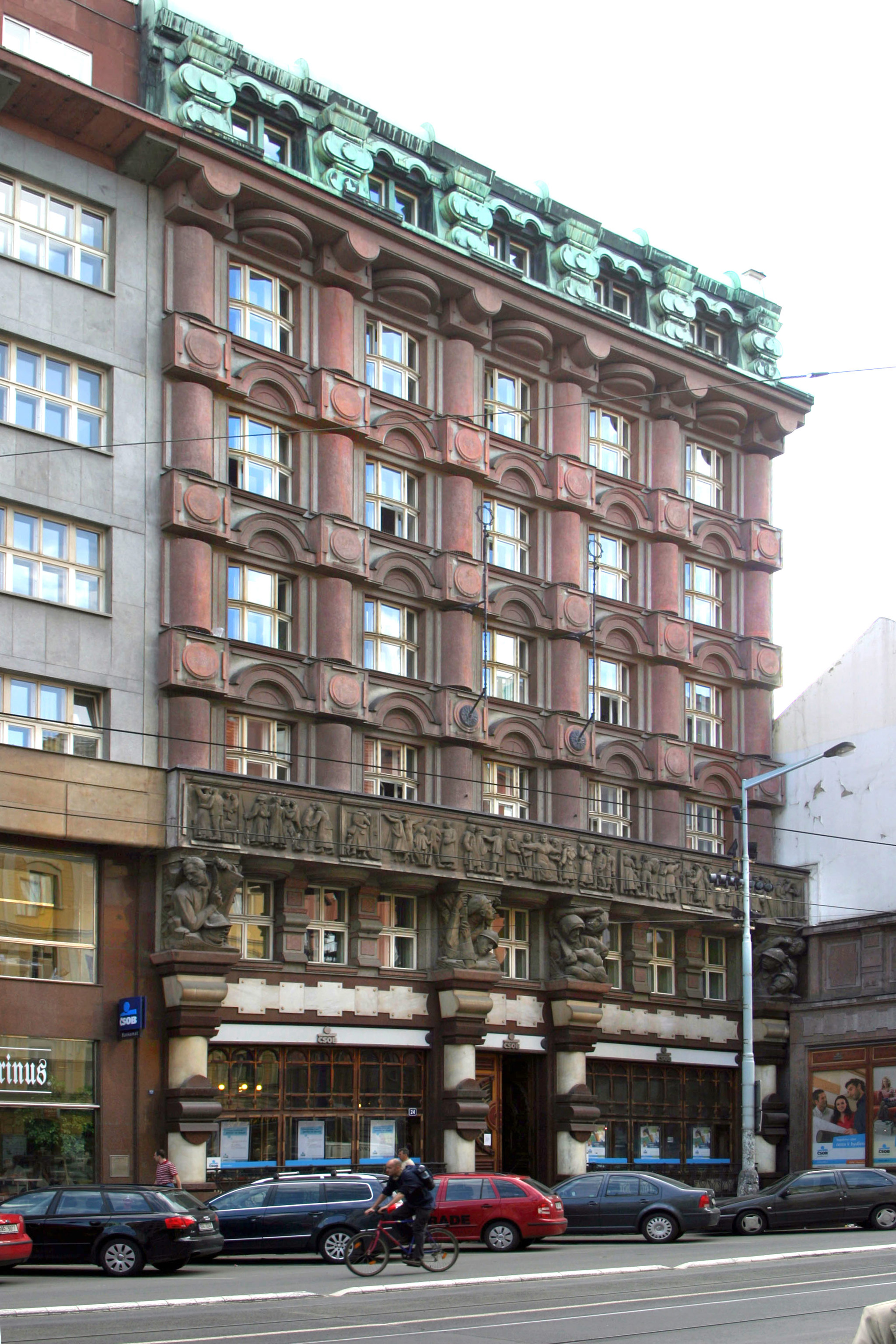
Rondocubist architecture by Josef Gocar: stacked civic ornament, round forms held inside a built facade.

Legiobanka interior hall in Prague
Legiobanka interior

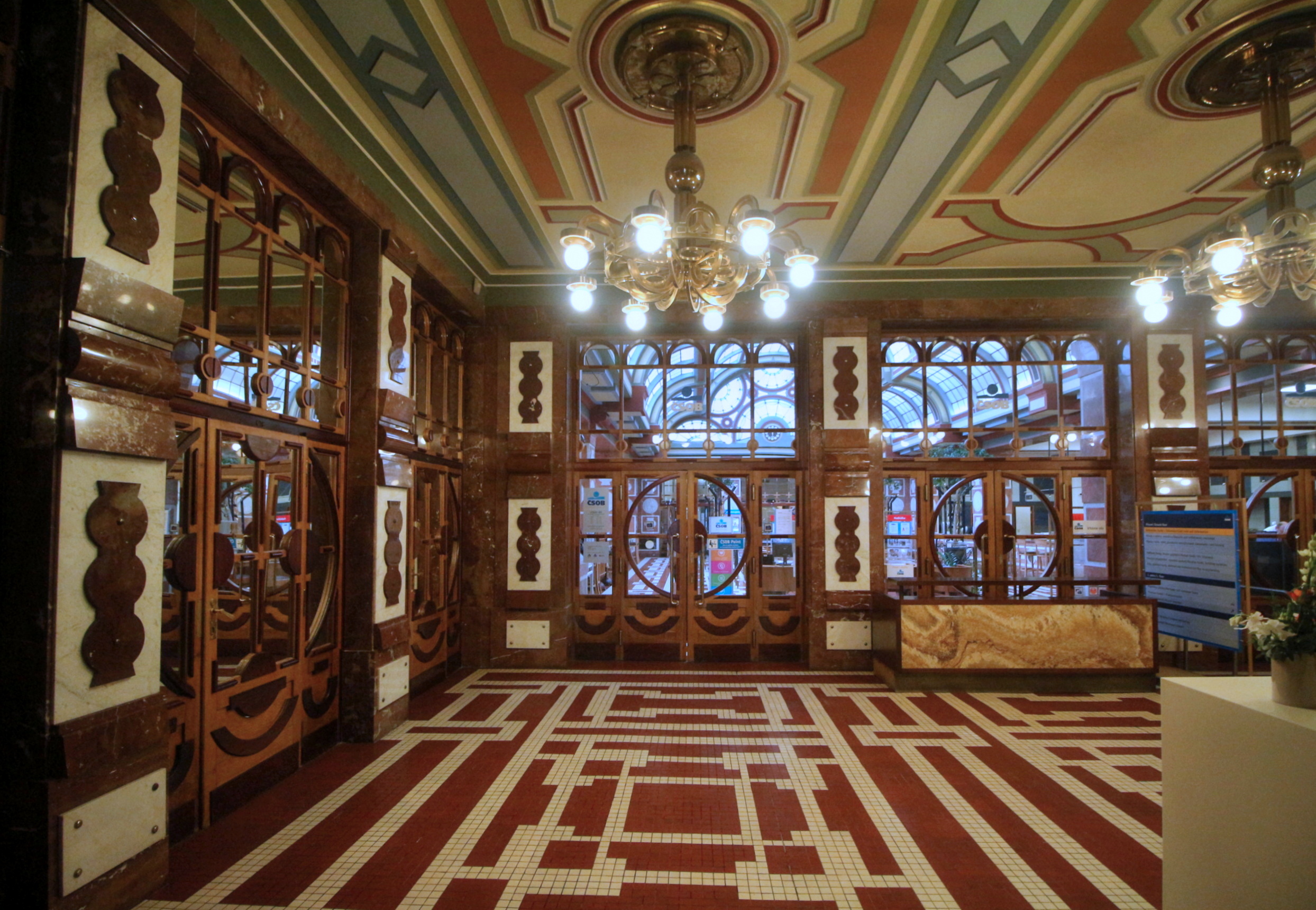
Interior rhythm, arches, repeated bands, and ceremonial geometry give the print a believable room-world.

Travelogue carousel test

This is the loose inspiration route: a place gathered through different times and surfaces, then pulled back into the print. The facts stay real; the generated studies can supply atmosphere where direct images are copyrighted or too literal.

Na Porici, 1920s

Start with Legiobanka: Josef Gocar, rondocubism, civic architecture using round ornament inside a disciplined facade.

factual anchor
Round cubism

The print's half-circles become believable through Prague's rare fusion of cubist structure with circles, ovals, and arches.

visual bridge
Bank hall / theatre light

The burgundy drops can be read through interior rhythm: pendants, arch shadows, civic halls, and repeated ceremonial bands.

room-world lead
Generated study

Flow prompt candidate: "Prague rondocubist bank-hall detail, cream arches, navy insets, burgundy pendant forms, flat editorial drawing."

fabricated visual

Direction 2

Working title
Prague Cubism softened into ornament
Source idea
The transition from Czech Cubism's angular geometry into a more rounded, decorative postwar language.
Why it fits visually
The wallpaper balances geometric order with rounded forms. It could be read as Cubism losing the prism and keeping the architectural discipline.
Research leads to investigate
House of the Black Madonna; Josef Chochol; Czech Cubist furniture; Cubo-Expressionism; rondocubist route in Prague.
Strength of direction
Strong
Risks / weaknesses
The print is much more round than crystalline. Pure Cubism may pull the story away from what is visibly there.

Direction 3

Working title
Theatre curtain / civic ornament
Source idea
Prague's civic decorative interiors: theatres, bank halls, foyers, and ornamented public rooms where repeated arches and medallions create ceremonial rhythm.
Why it fits visually
The print has a repeated pendant-like motif and a proscenium quality. The cream arcs and burgundy drops feel more interior and ceremonial than street-facing.
Research leads to investigate
Municipal House interiors; Prague theatre foyers; Art Deco banking halls; rondocubist interiors.
Strength of direction
Medium
Risks / weaknesses
Risk of becoming generic theatrical language unless a precise interior reference is found.

Optional Direction 4

Working title
Astronomical dial, stripped back
Source idea
Prague's clock and astronomical imagery translated into repeated circular registers.
Why it fits visually
The concentric arcs could support a dial-reading, and Prague has a famous clock culture.
Research leads to investigate
Prague Astronomical Clock; clock-face ornament; civic timekeeping.
Strength of direction
Low-medium
Risks / weaknesses
Too cliched and less visually specific than Rondocubism. Use only if Bruno wants a more familiar Prague hook, but it is not the best one.

Recommended direction

Legiobanka rondocubism is the clearest lead. It gives the print a real Prague-specific visual language, and the match between round forms, stacked ornament, and architectural cadence is unusually strong.

Initial sources / leads

Visible characteristics of the print

Large modular repeat made from off-white circles set over a diamond and triangle structure. Pink triangles sit below the circles, grey triangles above and below, with dark green and chocolate-brown side planes. The geometry is simple, bold, and balanced: circles, triangles, diamonds, and vertical joins create a decorative abstraction with a strong two-column rhythm.

Visual comparison

The strongest Paris lead should move away from facade architecture and into the city's abstract-geometric circles: groups, journals, salons, and objects where circle, square, triangle, colour, and construction became a visual language. Delaunay remains a useful backup for rhythm and mural scale.

Paris wallpaper pattern
Paris print

White discs over pink, grey, green, and brown triangles; bold modular rhythm.

Generated visual study for Cercle et Carre geometry
Cercle et Carre study

Generated study based on Paris geometric abstraction: circle, square, triangle, construction, equilibrium.

Robert Delaunay Rythme n.1
Delaunay backup

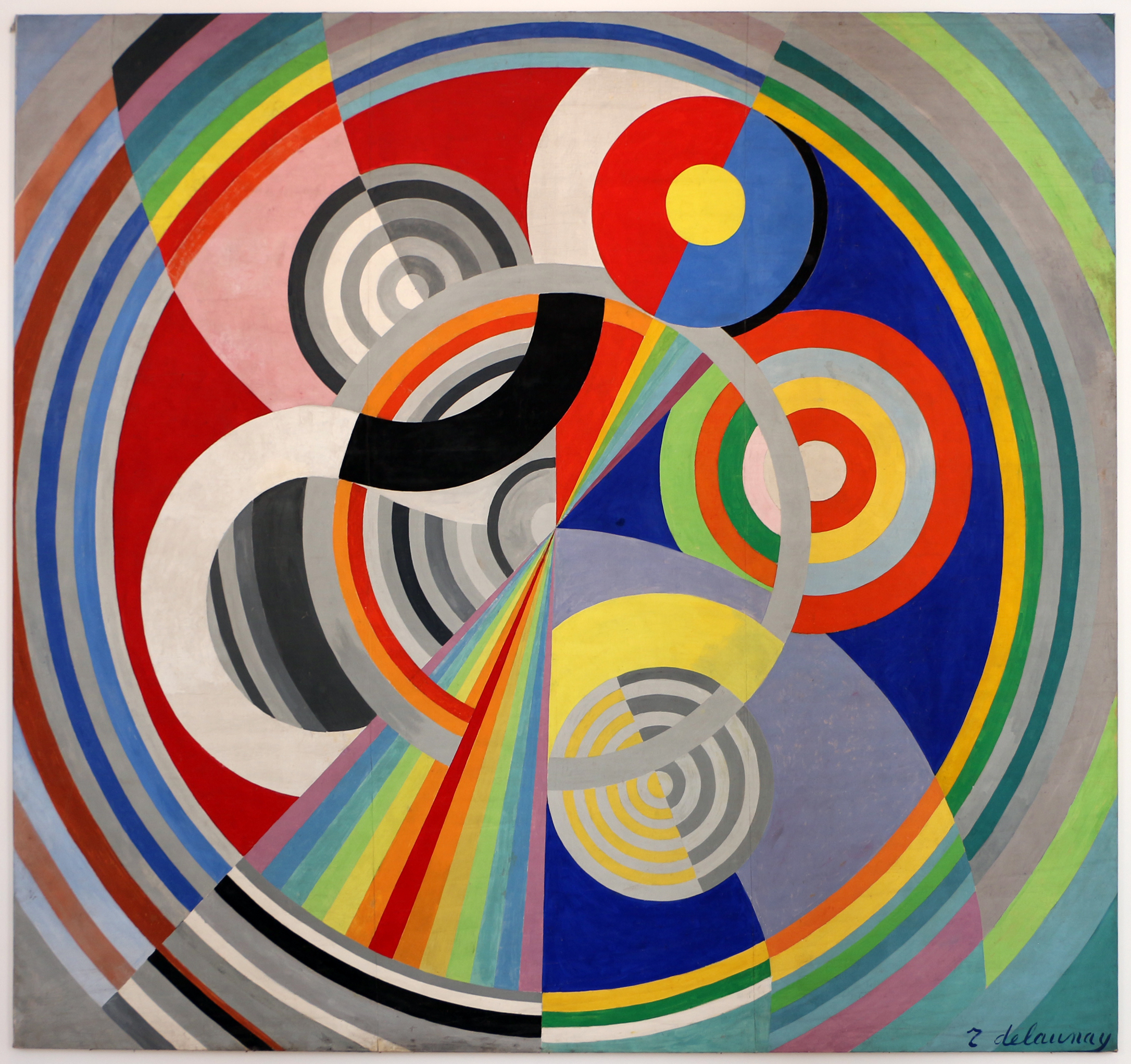
Useful for circular rhythm and mural scale, but less exact than the circle/square construction route.

Travelogue carousel test

This route lets Paris move across art, exposition, textile, and room memory. It does not need one literal source; it needs a chain of visual echoes that makes the print feel like it belongs to that place.

Cercle et Carre

Begin with the Paris group founded in 1929 by Torres-Garcia, Michel Seuphor, and Pierre Daura: circle, square, construction, equilibrium.

factual anchor
Galerie 23, Rue La Boetie

The group held its 1930 exhibition in Paris. The print can borrow that salon-world of precise geometric abstraction rather than a street facade.

cultural bridge
Circle over diamond

The wallpaper's white discs and square-diamond structure become the visual argument: the place memory is abstract, rational, decorative, and Paris-made.

visual bridge
Generated study

Flow prompt candidate: "Paris 1930 Cercle et Carre inspired geometric abstraction study, cream circles, square grid, pink grey green brown triangles, flat gouache."

fabricated visual

Direction 2

Working title
Paris 1925 decorative geometry
Source idea
The International Exhibition of Modern Decorative and Industrial Arts in Paris, 1925, and the decorative arts' turn toward geometric modernity.
Why it fits visually
The print is geometric but decorative: circles, triangles, symmetry, colour blocking, and a controlled ornament system. It can sit naturally in an Art Deco / arts decoratifs conversation.
Research leads to investigate
Exposition Internationale des Arts Decoratifs et Industriels Modernes; Musee des Arts Decoratifs; French Art Deco objects, textiles, furniture, and pavilions.
Strength of direction
Medium-high
Risks / weaknesses
Could become broad and over-familiar unless tied to a specific object, pavilion, textile, or exhibition detail.

Direction 3

Working title
Pavillon de l'Esprit Nouveau, softened
Source idea
Le Corbusier's 1925 Paris pavilion as a modular modern living idea, filtered through circles and colour rather than white-machine severity.
Why it fits visually
The repeat has a modular apartment-block logic: repeated cells, vertical joins, circles set inside a disciplined grid. The room-story could become about modern living units rather than Paris romance.
Research leads to investigate
Pavillon de l'Esprit Nouveau; Le Corbusier; 1925 exhibition; modular dwelling; Purism.
Strength of direction
Medium
Risks / weaknesses
The print is more decorative and colourful than the source world. This might feel intellectually clever but visually strained.

Optional Direction 4

Working title
Parisian salon object study
Source idea
A found-object route: a 1920s textile, book cover, theatre programme, ceramic plate, or fashion graphic from Paris rather than a building.
Why it fits visually
The print is decorative, repeatable, and object-like. Its circles and triangles could credibly grow from a small archive object scaled up to the wall.
Research leads to investigate
Musee des Arts Decoratifs archives; Sonia Delaunay fashion/textiles; Art Deco programme covers; Parisian ceramic or textile collections.
Strength of direction
Medium-high if a strong object is found
Risks / weaknesses
This remains unproven until a specific object is found. Good backup if architecture continues to fail.

Recommended direction

Cercle et Carre / Paris geometric abstraction is now the strongest lead. It has a cleaner visual argument than the earlier Paris architecture route and is more exact than Delaunay alone: the print is literally built from circles, square-diamonds, triangles, equilibrium, and repeated construction. Delaunay should stay as backup for circular rhythm, mural scale, and colour movement if we need a secondary reference in the Print Story.

Visible characteristics of the print

Dark green-black ground with repeated vertical fluted forms, cream stripe columns, blue bases, triangular pediment-like caps, grey stone planes, ochre diagonals, and tan-brown slanted bands. The print reads as an architectural collage: column, roof triangle, shadow, beam, and fragment rather than a continuous stripe.

Visual comparison

The stronger Athens route is not "classical columns". It is Athens as a city where fragments of antiquity were reworked by modern artists and architects: Dimitris Pikionis's Acropolis pathways and Yiannis Moralis's facade reliefs are better anchors because they already perform the act of recomposing memory into modern graphic structure. These reference images are for internal visual review only; generated studies are labelled separately.

Athens wallpaper pattern
Athens print

Fluted columns, triangular caps, dark ground, ochre diagonals, stone-coloured planes.

Pikionis Acropolis paving with rectangular stone slabs
Pikionis paving

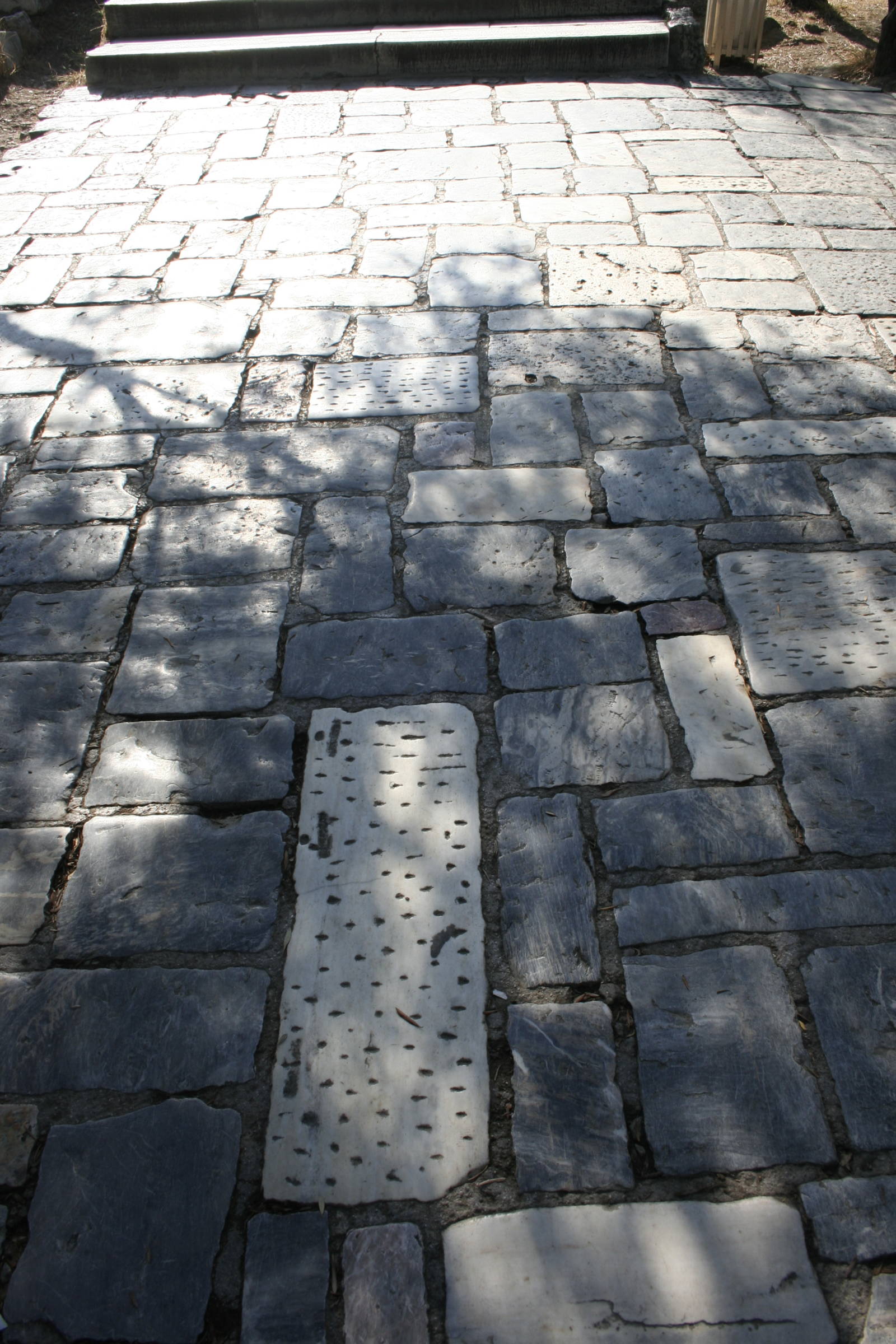
Real reference: rectangular stone fields, patched rhythm, pale slabs, dark joints, diagonal shade.

Pikionis Acropolis paving with irregular stone fragments and diagonal seams
Pikionis fragment field

Real reference: irregular stone fragments, hard seams, angled cuts, recomposed ground.

Yiannis Moralis relief composition on the Athens Hilton facade
Moralis / Hilton relief

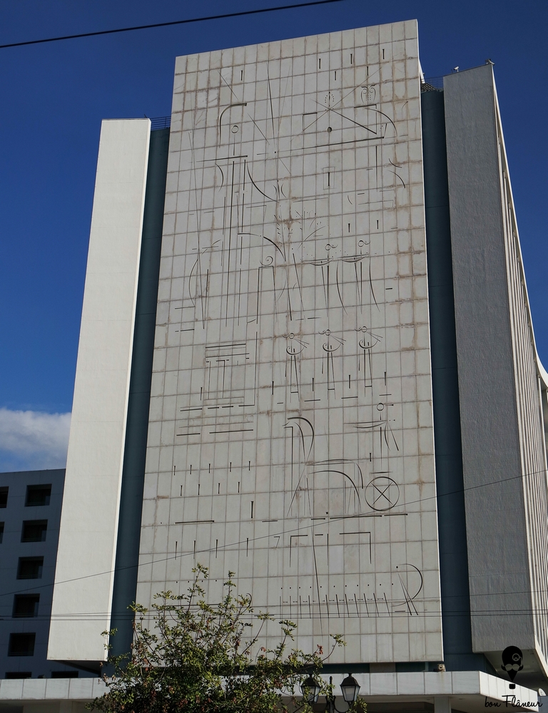
Real reference: incised verticals, facade grid, abstract Greek memory held on stone.

Generated visual study linking Pikionis paths and Moralis reliefs
Generated bridge study

Flow candidate only: paving fragments, relief lines, fluted afterimages, diagonal cuts.

Travelogue carousel test

Pikionis paths

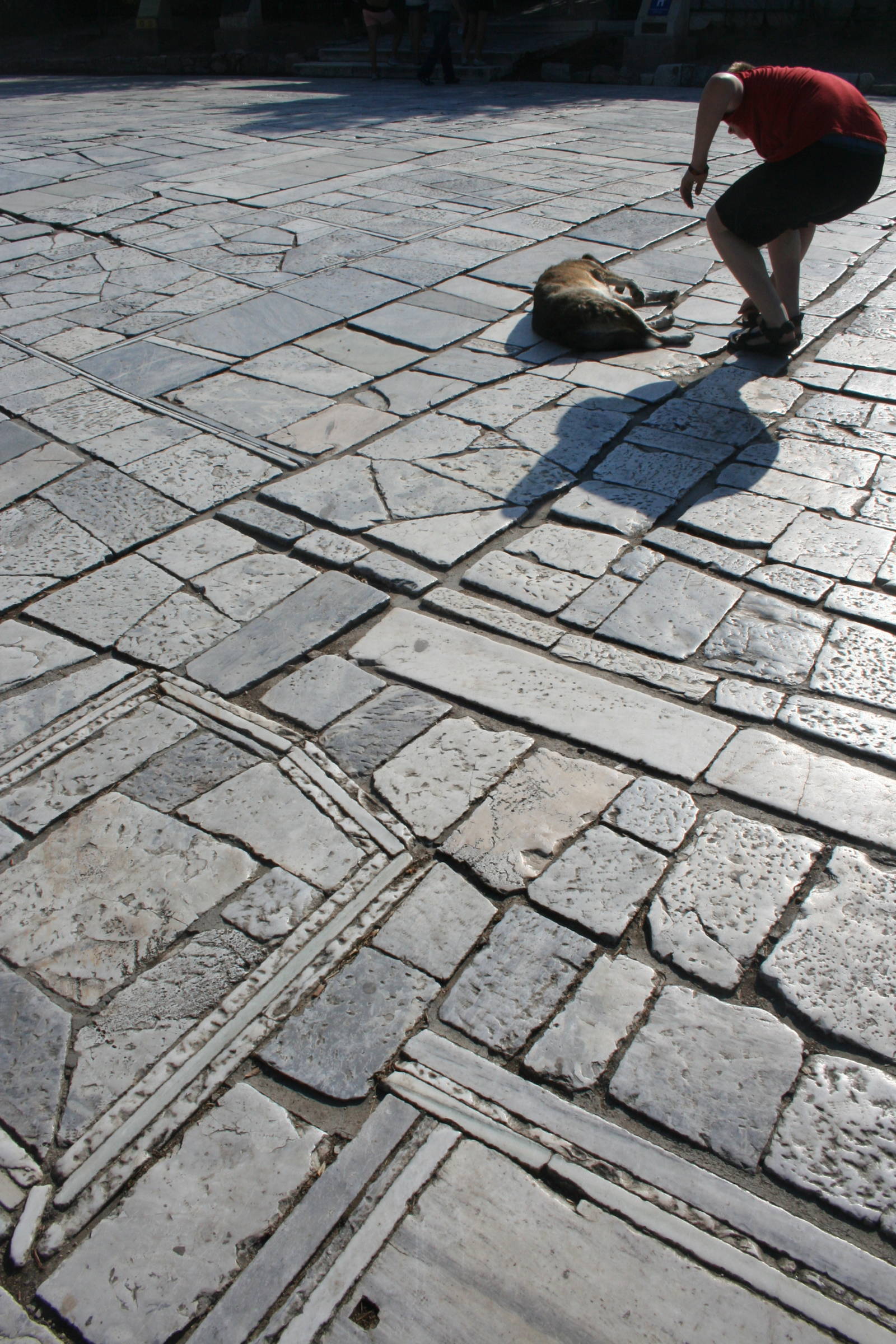
Begin underfoot: the 1950s paths around the Acropolis, assembled from stone fragments, spolia, and modern geometric decisions.

factual anchor
Moralis reliefs

Move to the Athens Hilton: modern facade reliefs where Greek memory becomes incised abstract monument, not literal ornament.

art/architecture bridge
Column afterimage

The wallpaper's fluted forms become afterimages of columns inside a larger collage of paving, relief, diagonal shade, and urban reconstruction.

visual bridge
Generated study

Flow prompt candidate: "Athens modernist memory study, Pikionis Acropolis paving fragments, Moralis facade relief lines, fluted column afterimages, ochre diagonal shadow, dark green ground."

fabricated visual

Direction 2

Working title
Moralis on the Hilton
Source idea
Yiannis Moralis's monumental facade reliefs for the Athens Hilton, where Greek themes and modern abstraction meet on a large architectural surface.
Why it fits visually
The print has an incised, facade-like quality: repeated verticals, diagonal marks, blocks, and dark/stone contrasts.
Research leads to investigate
Yiannis Moralis; Athens Hilton facade reliefs; Pentelic marble; Generation of the '30s; architectural compositions.
Strength of direction
Strong backup
Risks / weaknesses
Visual relation is conceptually excellent but less shape-literal than Pikionis; best as co-anchor or secondary lead.

Direction 3

Working title
Column as afterimage
Source idea
The obvious column/fluting language treated as a residual memory, not the main origin: Athens remembered through fragments rather than quoted directly.
Why it fits visually
It explains the visible flutes and pediment-like caps while letting the stronger story come from actual modern Athens references.
Research leads to investigate
Doric fluting; pediments; museum fragments; neoclassical fragments in Athens; hard diagonal light.
Strength of direction
Medium-high
Risks / weaknesses
Too easy on its own. Keep it as supporting visual evidence, not the headline story.

Recommended direction

Pikionis underfoot is the better lead. It is a real Athens reference and a surprise: the city is not approached through the temple facade but through the modern pathway made from fragments, spolia, diagonals, stone planes, and recomposed memory. Moralis/Hilton should sit beside it as the second anchor: Athens turning Greek memory into large-scale abstract architectural surface. The obvious column/fluting motif stays in the background as visible evidence, not the whole story.

Visible characteristics of the print

Cream ground with repeated blush-pink half-disc forms, brown triangular planes, pale yellow stepped verticals, blue central bars, and slim black vertical bands. The pattern has a soft Art Deco geometry: fan, sunrise, stepped facade, racing stripe, and pastel block rhythm.

Visual comparison

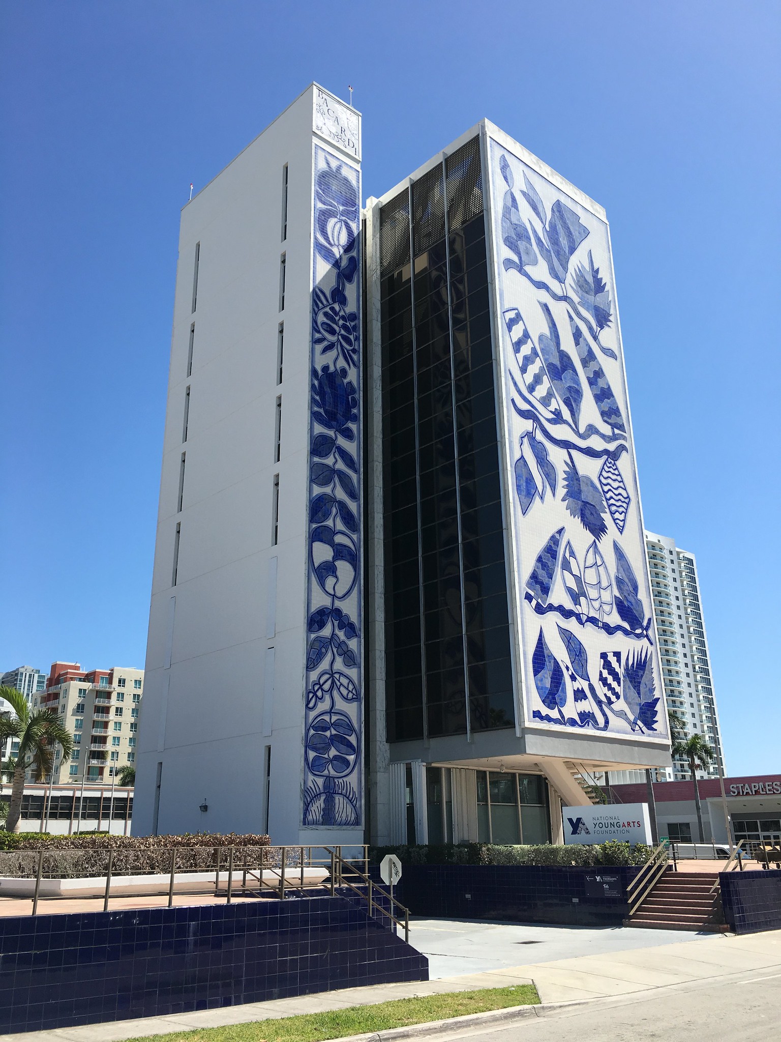
The Miami lead gets much stronger when it moves from broad Art Deco into a specific Ocean Drive facade hook. McAlpin gives the print a direct visual anchor: blush circular forms, mint-blue vertical spine, cream wall, coral ledges, grouped horizontal bars, and an almost face-like symmetry. Bacardi stays useful as a Miami tropical-modern backup, especially for tile, blue-white surface, and architectural art.

Miami wallpaper pattern
Miami print

Pastel half-discs, stepped yellow verticals, blue racing stripe, brown triangular planes.

McAlpin Ocean Plaza facade in Miami Beach
McAlpin facade

Real reference: mint vertical spine, coral discs and ledges, cream wall, grouped horizontal bars.

Vintage postcard of the McAlpin Hotel in Miami Beach
McAlpin postcard

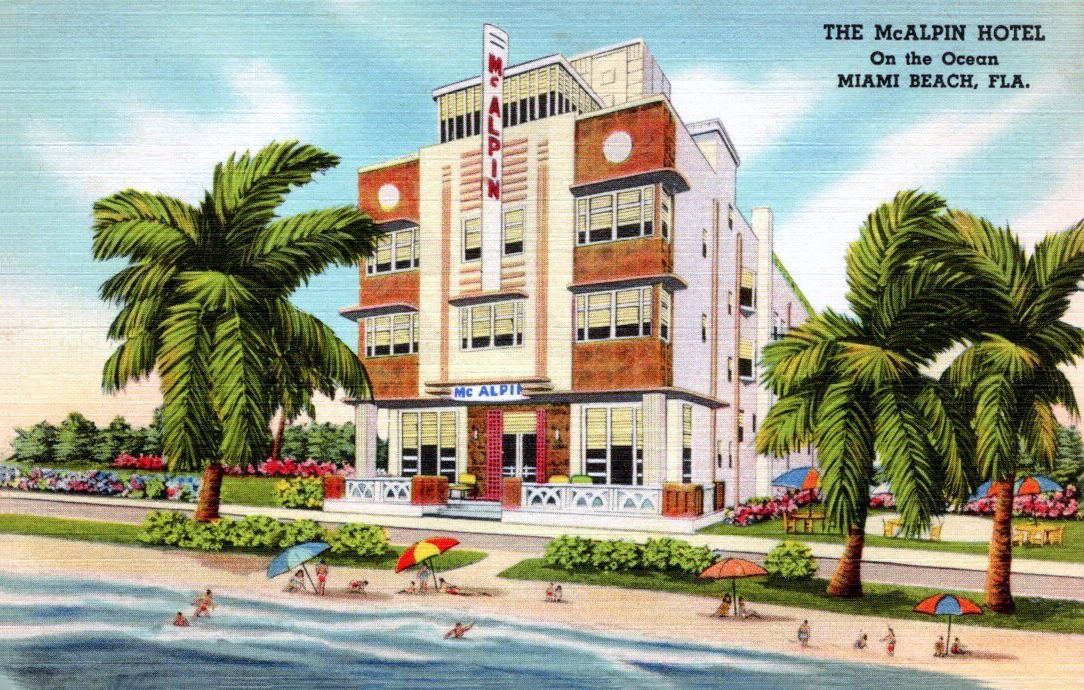
Real archive image: printed colour memory, beachside facade, coral/mint/cream travelogue mood.

Bacardi Building Miami with blue and white tile mural
Bacardi tile-modernism

Real backup: blue-white azulejo mural, tropical modern surface, art fused to a Miami facade.

Generated Miami Art Deco visual study
Generated bridge study

Flow candidate only: pastel facade geometry, circular plaques, central stripe, cream plane.

Travelogue carousel test

South Beach Deco

Start with Miami Beach's large concentration of Art Deco buildings: pastel colour, geometric forms, vertical emphasis.

factual anchor
Racing stripes

The blue and black verticals can connect to Streamline Moderne bands, hotel signage, and facade strips.

visual bridge
Pastel sunburst

The blush half-discs and cream triangles give the wall a softer tropical Deco mood without becoming beach literal.

colour memory
Generated study

Flow prompt candidate: "Miami Beach Art Deco facade study, pastel pink fan, cream geometry, blue racing stripe, stepped yellow verticals, flat gouache."

fabricated visual

Direction 2

Working title
Bacardi tile-modernism
Source idea
The Bacardi Building as Miami tropical modernism: blue-white azulejo murals by Francisco Brennand set into a modernist tower.
Why it fits visually
The print's blue vertical passage and architectural block logic could connect to Miami as tile, mural, and facade, though the colour/form match is less immediate than McAlpin.
Research leads to investigate
Bacardi Building; Francisco Brennand; azulejo murals; YoungArts campus; tropical modernism; architectural art in Miami.
Strength of direction
Strong backup
Risks / weaknesses
Visually compelling but less close to the pink/yellow geometry of the actual print. Better as secondary Miami-modernism support.

Direction 3

Working title
Postcard facade
Source idea
Miami through printed travel ephemera: hotel postcards, programme covers, signage, and pastel graphic memory.
Why it fits visually
The print has an immediate graphic-poster quality, with simplified shapes and optimistic colour.
Research leads to investigate
Vintage Miami Beach postcards; Art Deco Weekend posters; hotel signage; preservation campaign graphics.
Strength of direction
Medium-high
Risks / weaknesses
Could become nostalgic. Better as carousel material than main origin.

Recommended direction

McAlpin facade memory is the strongest route. The print already contains the building's most useful visual hooks: cream ground, coral-pink circular forms, mint-blue vertical spine, grouped horizontal bars, and a playful symmetry that feels like a hotel facade remembered as pattern. Bacardi stays as the more surprising secondary reference if we want a Miami-modernism carousel behind the main story.

Visible characteristics of the print

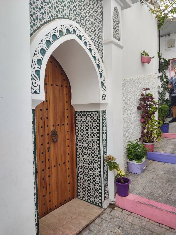
Block-built architectural repeat with tall ochre rounded arches set into cream bases and reddish-brown wall fields. Vertical stripe panels in sage, stone, cream, and very dark green interrupt the arches. The repeat is staggered and wall-like, reading as doors, arcades, shutters, awnings, or tiled architectural bands.

Visual comparison

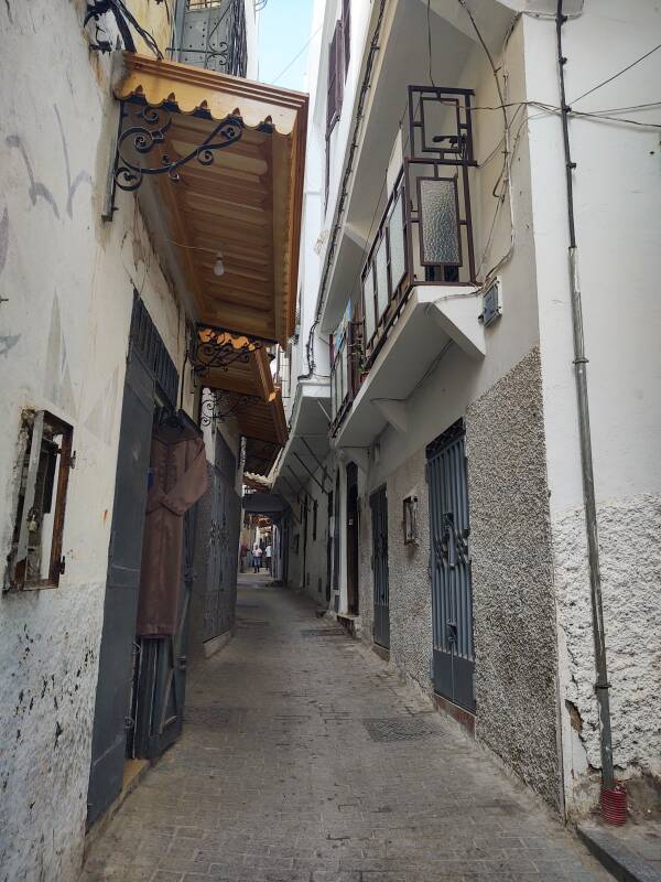
The Tangiers lead is strong when it is not just "Moroccan arch". The print is about arch plus stripe: medina gates, layered thresholds, striped shade, green tile, cream plaster, and brown shadowed walls. These references are for internal visual review; publication rights are not verified unless separately licensed.

Tangiers wallpaper pattern
Tangiers print

Ochre arches, brown wall fields, cream bases, sage and dark green vertical stripe panels.

Tangier medina doorway with arched plaster and green tile
Green tile threshold

Real reference: white plaster arch, green tile bands, warm timber, upright threshold rhythm.

Tangier kasbah gate with ochre brick arch and pale plaster walls
Kasbah gate

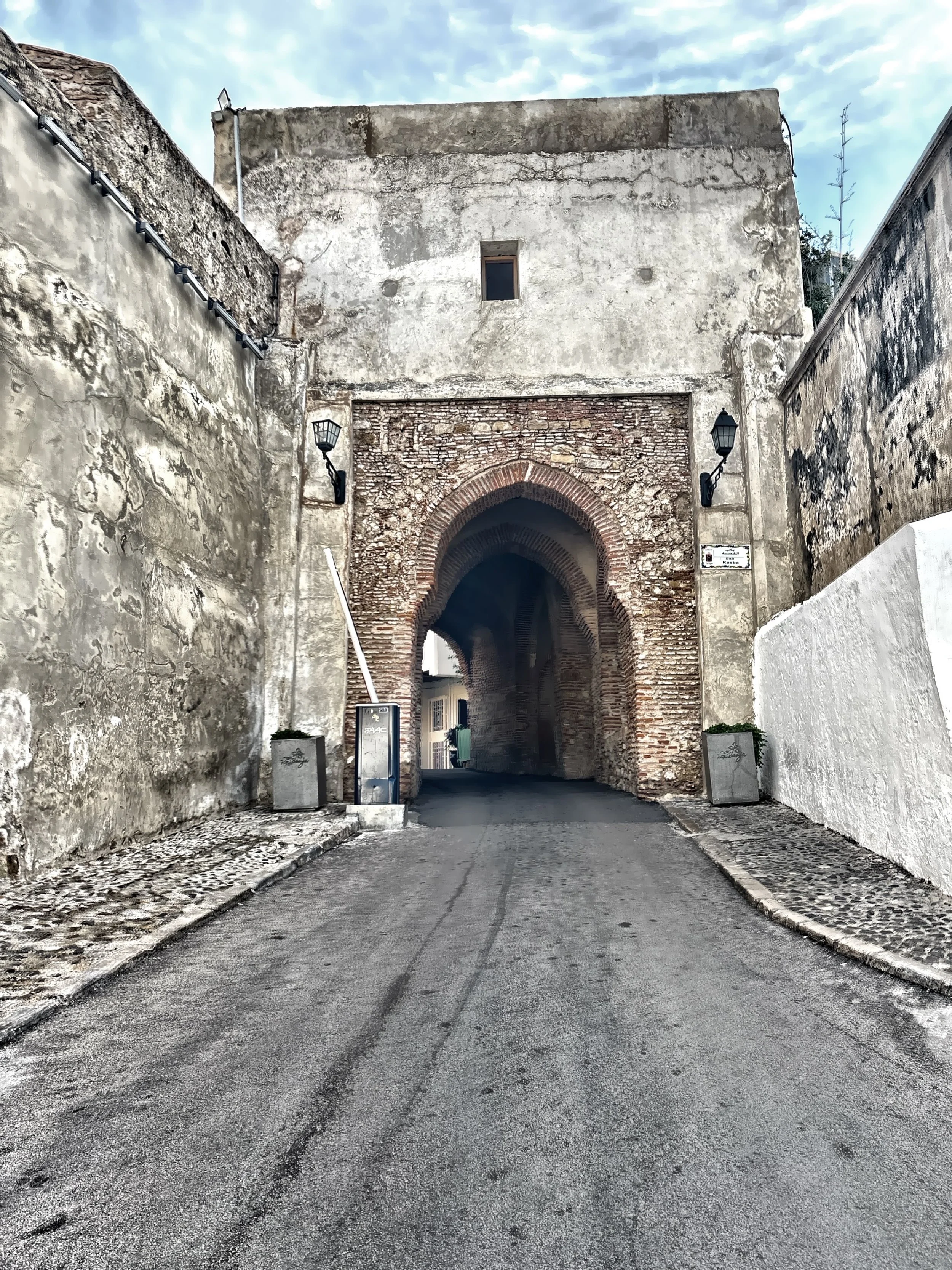
Real reference: rounded gate, ochre-brown wall mass, cream plaster, dark interior cut.

Tangier medina passage with arch, blue walls, tile, and vertical supports
Layered passage

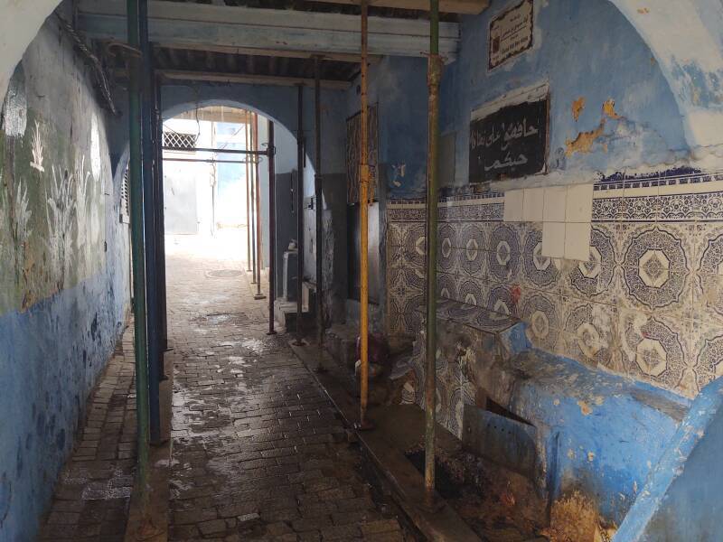
Real reference: repeated arches, tile banding, narrow uprights, shaded corridor depth.

Tangier medina lane with projecting striped shade and white walls
Striped shade

Real reference: projecting awnings, cream walls, narrow verticals, compressed street rhythm.

Generated Tangiers arch and stripe visual study
Generated bridge study

Flow candidate only: arch, striped wall panels, green tile, cream plaster, ochre wall fields.

Travelogue carousel test

Medina gates

Begin with Tangier as a city of thresholds: arches, gates, doorways, and layered entry points.

factual anchor
Green tile / white stucco

Use the green, cream, and ochre relationship through tile, plaster, mosque details, and shaded interiors.

material bridge
Striped shade

The vertical panels can come from shutters, awnings, tiled bands, and narrow passages where light breaks into stripes.

visual bridge
Generated study

Flow prompt candidate: "Tangier medina arch and stripe study, ochre horseshoe arches, cream plaster, green tile bands, brown walls, flat editorial drawing."

fabricated visual

Direction 2

Working title
Port city facade
Source idea
Tangier as a layered port city, where Arab, Andalusian, European, and modern details sit against one another.
Why it fits visually
The print is not one motif alone; it alternates arch, stripe, wall block, and colour band like a city built in layers.
Research leads to investigate
International Zone Tangier; medina / ville nouvelle contrasts; colonial-era facades; port-city signage.
Strength of direction
Strong backup
Risks / weaknesses
More historical and less immediately visual unless anchored with a clear generated study.

Direction 3

Working title
Tile band and doorway
Source idea
A found-object/material route: zellij bands, ceramic borders, arched doors, painted plaster.
Why it fits visually
The repeated stripe panels beside arches look like tile borders or decorative side bands.
Research leads to investigate
Zellij tile; Moroccan arch profiles; door surrounds; museum/heritage tile details.
Strength of direction
Medium-high
Risks / weaknesses
Could become too craft-generic. Best as material support within Direction 1.

Recommended direction

Arch and stripe threshold is the strongest lead. It gives the print a clear Tangier memory without reducing it to a generic arch: ochre thresholds, cream plaster, green tile, brown shadow, and striped shade.

Initial sources / leads

Visible characteristics of the print

Cream ground with alternating vertical totem forms. Each unit combines a deep navy rounded arch or half-disc, black rectangular side blocks, muted sage-grey vertical panels, ochre horizontal bars, blush-pink narrow inserts, cream line details, and pale taupe circles. The pattern reads as door, window, lintel, plaque, and column stacked into a repeated architectural rhythm.

Visual comparison

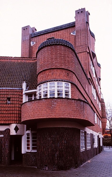
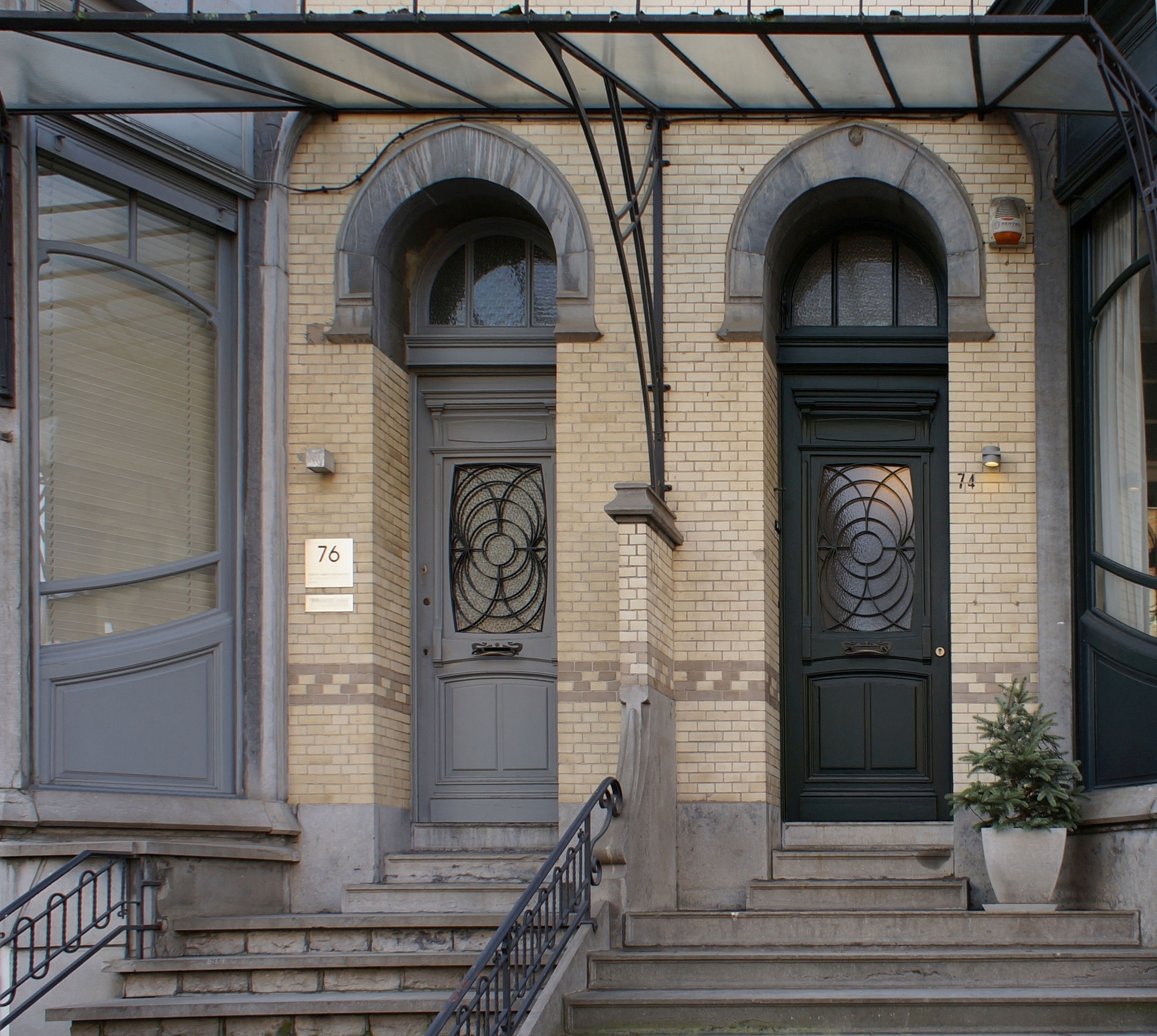
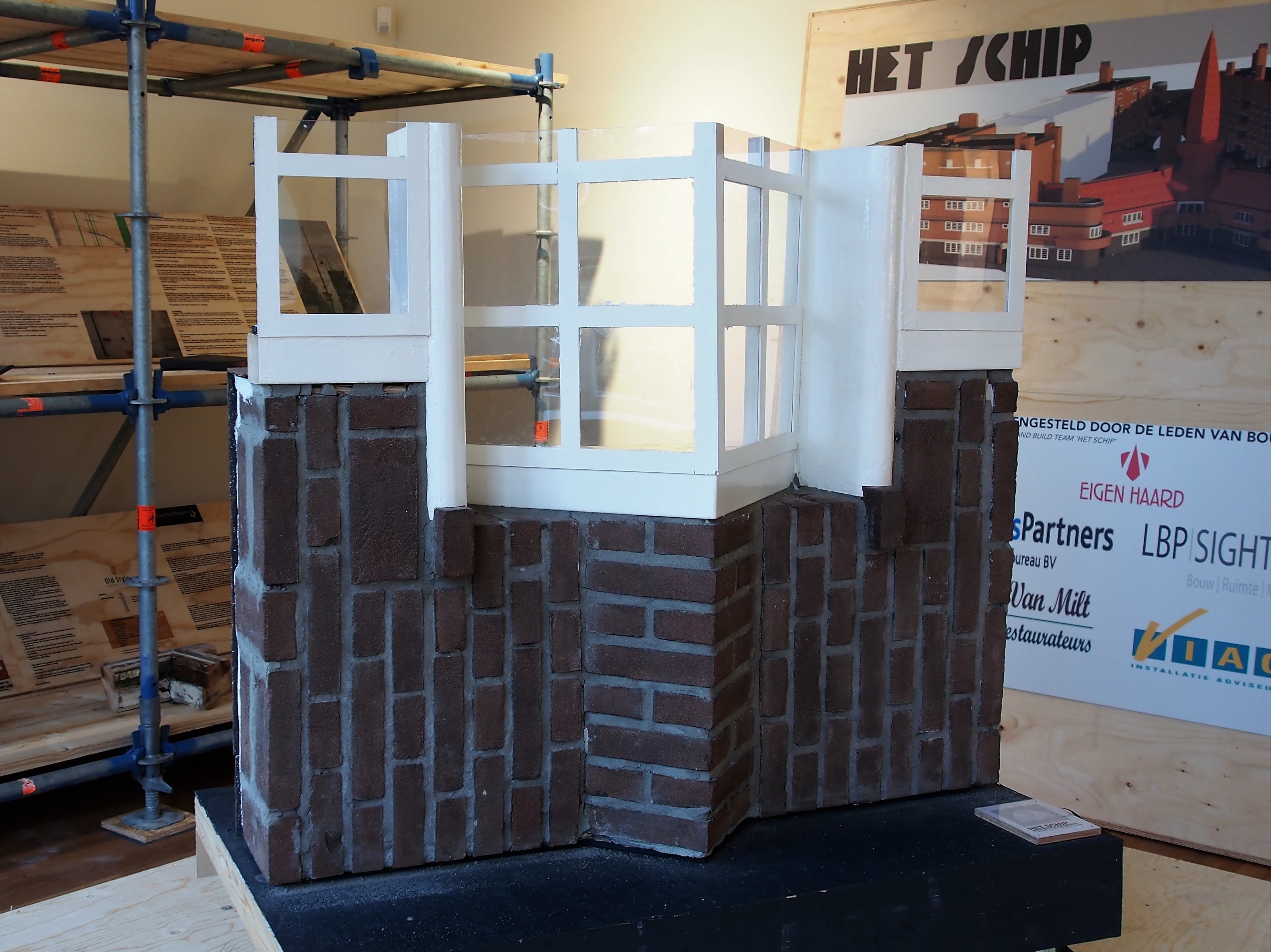
The strongest Amsterdam route is not a simple De Stijl grid. The print has a warmer, more eccentric Amsterdam School logic: coloured door details, elongated windows, rounded brick-expressionist forms, and upright architectural panels. The relationship is strongest where the pattern becomes a memory of entrances and stained-glass cuts rather than a direct facade copy.

Amsterdam wallpaper pattern
Amsterdam print

Deep rounded navy forms, sage panels, ochre lintels, blush inserts, taupe circles.

Het Schip facade in Amsterdam
Het Schip facade

Real reference: Amsterdam School massing, rounded brick architecture, compressed window rhythm.

Het Schip stained glass door detail
Door glass detail

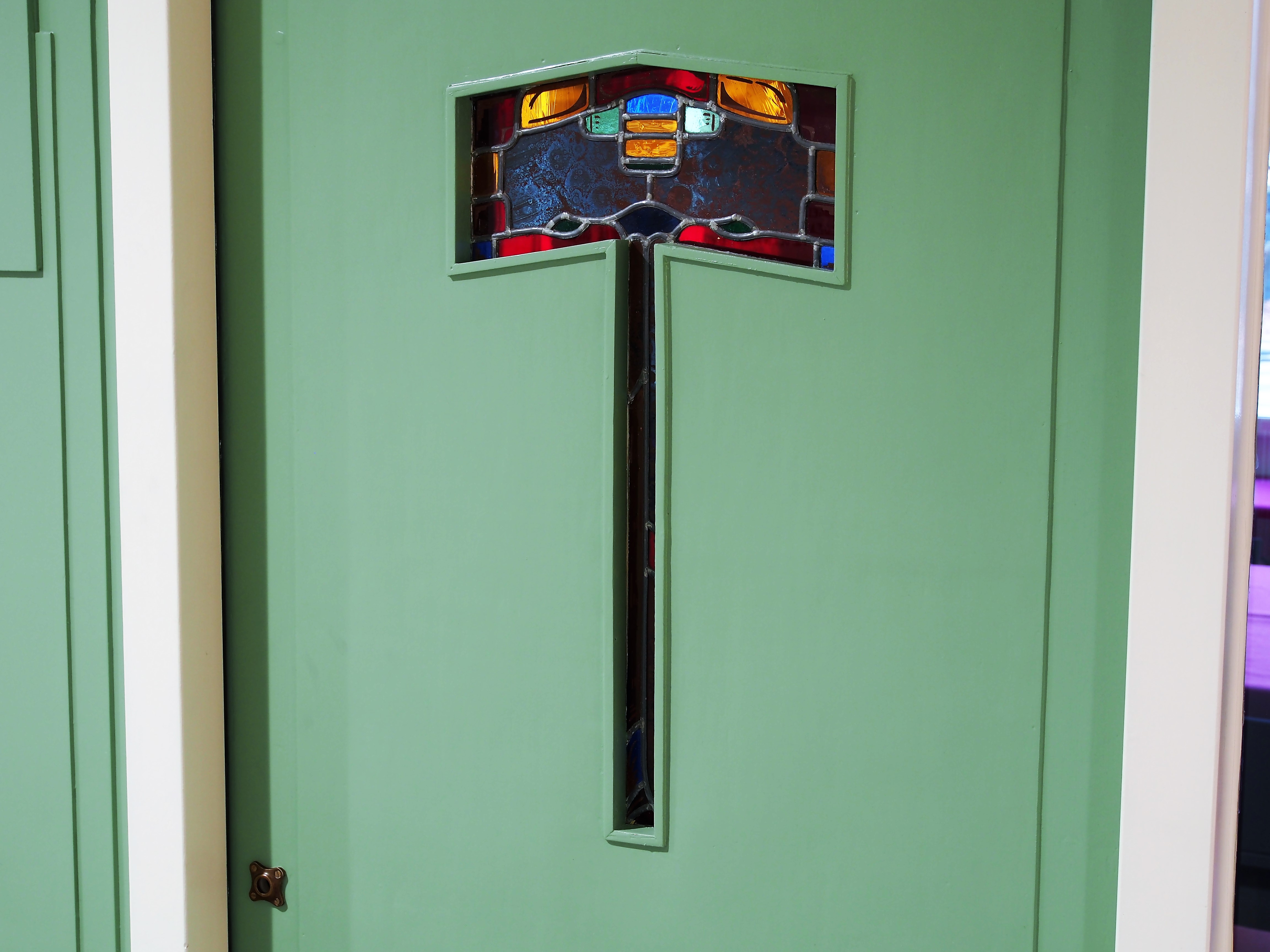
Real reference: mint-green door field, stained-glass colour blocks, narrow central vertical.

Amsterdam School window model at Het Schip
Window / brick rhythm

Real reference: white window frames over brick courses, vertical stacking, panelled domestic scale.

Generated Amsterdam School visual bridge study
Generated bridge study

Flow candidate only: door, stained glass, rounded facade, sage panels, ochre bars.

Travelogue carousel test

Het Schip / Amsterdam School

Start with expressive brick housing, rounded corners, crafted doors, and domestic modernism with a human, handmade charge.

factual anchor
Door as pattern

The blush verticals and pale lines can come from stained glass and door insets, scaled into a wall repeat.

visual bridge
Rounded facade memory

The navy arches and taupe circles move the story away from strict modernist grid into Amsterdam's softer, idiosyncratic geometry.

shape bridge
Generated study

Flow prompt candidate: "Amsterdam School doorway and Het Schip facade memory, rounded dark blue arch, sage door panels, pink stained glass strip, ochre brick lintel, flat gouache."

fabricated visual

Direction 2

Working title
Canal-house threshold, modernised
Source idea
Amsterdam entrances, fanlights, stacked door frames, stone steps, and canal-house thresholds abstracted into repeated upright markers.
Why it fits visually
The print has a threshold logic: upright panels, circles, lintels, and dark door-like voids.
Research leads to investigate
Amsterdam canal-house doorways; fanlights; gable markers; door-number plaques; painted doors.
Strength of direction
Medium
Risks / weaknesses
Can become too familiar and city-postcard unless tied to a strange specific door or object. Amsterdam School is more distinctive.

Direction 3

Working title
Stedelijk grid meets domestic colour
Source idea
Amsterdam graphic modernism around the Stedelijk and Dutch design grids, softened by domestic colour and architectural shape.
Why it fits visually
The repeat is disciplined and modular, with vertical alignment and measured rectangles, but the rounded navy forms make it less purely graphic.
Research leads to investigate
Wim Crouwel; Total Design; Stedelijk catalogues; Dutch graphic grids; 1960s Amsterdam design.
Strength of direction
Medium
Risks / weaknesses
The visual evidence leans more architectural and object-like than poster/grid. Useful backup, not headline.

Recommended direction

Amsterdam School doorway memory is the best lead. It gives the print a specific Amsterdam visual world without falling into canal cliche or De Stijl shorthand: rounded dark forms, sage door fields, stained-glass strips, ochre lintels, and repeated domestic thresholds.

Visible characteristics of the print

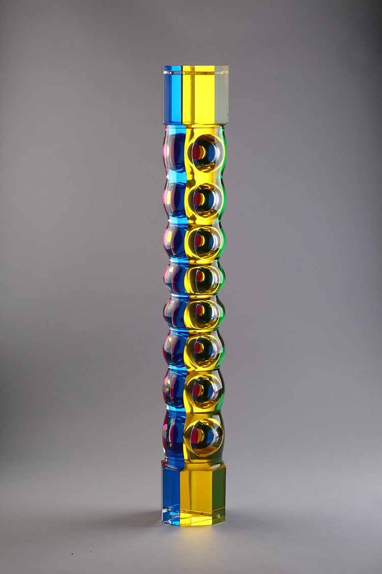
Dark navy ground with large nested circular arcs and repeated U-shaped forms. Pale peach, cool grey, teal-blue, black, and warm brown lines wrap into overlapping loops, half-circles, and rounded channels. The design reads less like a conventional motif than a system of painted ribs, bracket curves, and roof-edge ornament folding back on itself.

Visual comparison

The stronger Busan hook is Beomeosa rather than the Cinema Center. The dancheong under the eaves has the right kind of repetition: dark structural shadow, green-blue fields, peach and ochre bands, rounded painted brackets, and layered roof-edge rhythm. It gives the print a specific Busan source that is more surprising than film architecture and closer to the actual colour-and-line behaviour.

Busan wallpaper pattern
Busan print

Overlapping circular arcs, U-shaped channels, teal-blue and peach lines on navy.

Beomeosa Temple dancheong eaves in Busan
Beomeosa dancheong

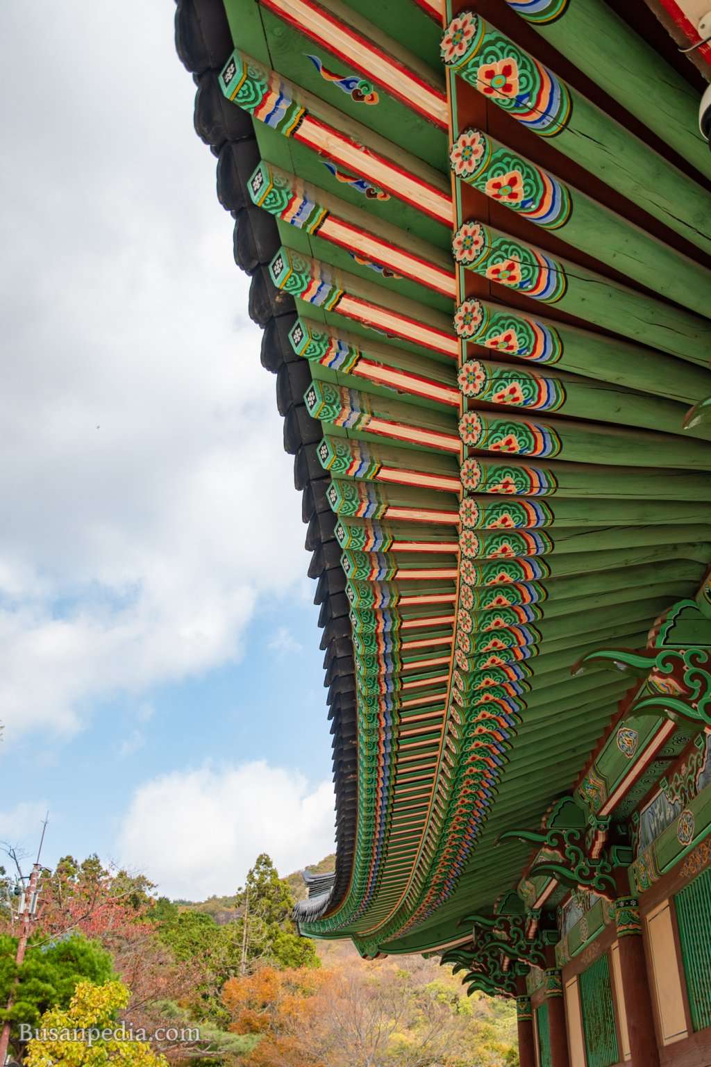
Real reference: painted eaves, green ground, peach/blue bands, repeated bracket rhythm.

Beomeosa Temple entrance path and gate in Busan
Beomeosa threshold

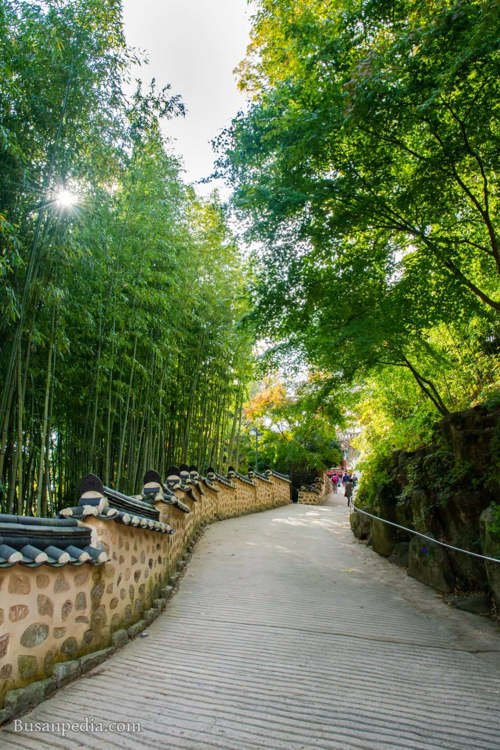
Real reference: approach, roof-tile curves, mountain setting, temple as Busan memory.

Busan Cinema Center at night
Cinema Center backup

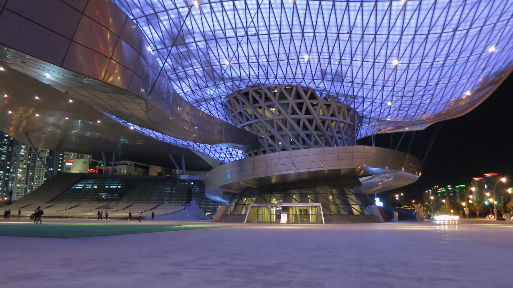
Useful secondary reference for night-blue architecture and looping public movement.

Generated Busan cinema architecture visual study
Generated bridge study

Flow candidate only: dancheong eaves translated into nested modern arcs.

Travelogue carousel test

Beomeosa eaves

Begin above the temple threshold: painted timber ribs, repeated brackets, colour bands, and dark roof shadow.

factual anchor
Dancheong as linework

The peach, teal, grey, and brown outlines can be argued through painted beam ends and bracket patterns, not generic curves.

architecture bridge
Golden fish legend

Beomeosa's name is tied to Geumsaem, the golden well, and a fish from the sky; this can softly support the rounded, swimming rhythm without becoming literal.

object bridge
Generated study

Flow prompt candidate: "Busan Beomeosa dancheong eave memory, dark navy shadow, teal painted brackets, peach and ochre line bands, nested U arcs, flat modernist wallpaper study."

fabricated visual

Direction 2

Working title
BIFF canopy loops
Source idea
Busan Cinema Center and the Busan International Film Festival: public cinema architecture, a glowing roof canopy, Double Cone entrance, ramps, and night-event movement.
Why it fits visually
The pattern can still be read through auditorium arcs, film loops, roof curves, and circulation paths compressed into pattern.
Research leads to investigate
Busan Cinema Center; Coop Himmelb(l)au; BIFF; Dureraum; Double Cone; LED canopy; outdoor cinema plaza.
Strength of direction
Strong backup
Risks / weaknesses
Too obvious and a little sleek compared with the earthy painted colour of the product. Better as backup.

Direction 3

Working title
Film reel / auditorium plan
Source idea
A found-object route from cinema diagrams: reel circles, projection loops, seating arcs, ticket counters, and festival maps.
Why it fits visually
The pattern looks like diagrammed movement: repeated loops, rounded tracks, half-circles, and interlocking channels.
Research leads to investigate
BIFF archive posters; cinema seating plans; film-reel diagrams; festival identity graphics; old theatre programmes.
Strength of direction
Medium-high
Risks / weaknesses
Less place-specific unless anchored to Busan Cinema Center or BIFF.

Recommended direction

Beomeosa dancheong eaves is the stronger lead. It is specific to Busan, materially rich, and visually closer to the print: repeated bracket rhythm, dark roof shadow, green-blue fields, peach bands, ochre-brown structure, and nested painted curves. Cinema Center stays as a backup if we want a contemporary Busan layer in the carousel.

Visible characteristics of the print

Pale green-grey ground with large yellow discs and black concentric linework forming half-circles, quarter-circles, spiralling pivots, and dotted radial edges. The pattern has a clear optical structure: graphic circles sliced into moving segments, with yellow fields sliding behind dense black arcs.

Visual comparison

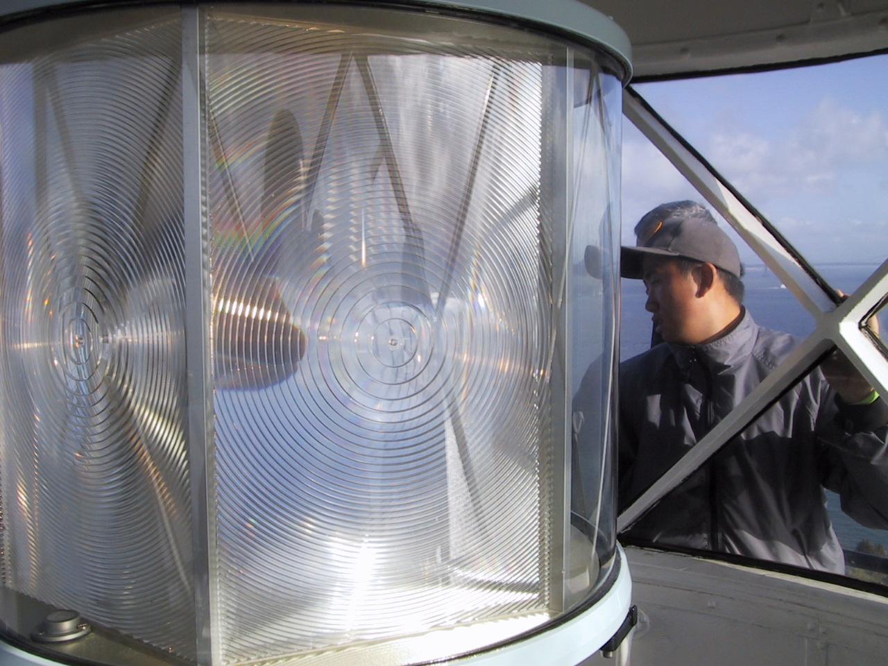
The stronger San Francisco route is optical light, not psychedelic style. The Alcatraz lighthouse Fresnel lens gives the print a real Bay object with concentric rings, radial pivots, glass arcs, yellow-white light, and a relationship to fog, water, and navigation. The poster route stays useful as a cultural backup, but the lighthouse lens is the cleaner surprise.

San Francisco wallpaper pattern
San Francisco print

Yellow discs, black concentric arcs, radial pivots, dotted edges, pale green-grey ground.

Fresnel lens in the Alcatraz Lighthouse in San Francisco
Alcatraz Fresnel lens

Real reference: concentric glass prisms, radial light, Bay navigation, optical precision.

Victor Moscoso San Francisco psychedelic poster with concentric circles
Moscoso backup

Real reference, rights not cleared: San Francisco poster culture with hypnotic circles inside circles.

Generated San Francisco psychedelic op-art visual study
Generated bridge study

Flow candidate only: Fresnel rings, yellow light discs, optical arcs, fog-green field.

Travelogue carousel test

Alcatraz light

Start in the Bay: a lighthouse lens, concentric glass, fog, water, and rotating light rather than city iconography.

factual anchor
Fresnel rings

The wallpaper's black arcs can become simplified glass ridges and beam paths, with yellow discs as held light.

visual bridge
Poster city backup

The same optical language can later pass through Avalon/Fillmore graphics, but only after the lens gives it a sharper origin.

colour bridge
Generated study

Flow prompt candidate: "San Francisco Bay Fresnel lens origin study, Alcatraz lighthouse optics, yellow light discs, pale fog green ground, black concentric glass arcs, modernist wallpaper study."

fabricated visual

Direction 2

Working title
Avalon optical poster rings
Source idea
San Francisco psychedelic concert posters, especially Victor Moscoso's Avalon Ballroom work where concentric circles, vibrating colour, and optical movement become the main event.
Why it fits visually
The print shares a local optical-circle language: concentric arcs, sliced discs, radial pivots, black line vibration, and strong yellow fields.
Research leads to investigate
Victor Moscoso; Family Dog Productions; Avalon Ballroom; Fillmore posters; Summer of Love graphic design; op art in psychedelic posters.
Strength of direction
Strong backup
Risks / weaknesses
Can become broad and cliched if used as the main story. Also has image-rights friction. Best as a secondary cultural echo.

Direction 3

Working title
Exploratorium wave field
Source idea
A science/art route through the Exploratorium: wave interference, circular wave tanks, perception, optics, and hands-on visual experiments at the waterfront.
Why it fits visually
The dotted radial edges and circular pivots could support wave-interference and optical-experiment language, especially with the pale ground and black line systems.
Research leads to investigate
Exploratorium water waves exhibit; Wave Organ; perception exhibits; circular wave interference; waterfront science-art culture.
Strength of direction
Medium-low
Risks / weaknesses
Good intellectual bridge, but weaker as a place-memory than the Alcatraz lens.

Recommended direction

Alcatraz Fresnel light is the stronger lead. It is more surprising, more specific, and visually clean: a San Francisco Bay object made from concentric rings, radial light, glass optics, fog, and navigation. Avalon / Moscoso stays as backup if we want to give the story a later cultural echo, but it should not be the main hook.